When the Shelf
Fell Short
(Info)
Client
Walmart
Category
UI & UX
/
Physical Kiosk
Role
Lead Designer / Development
Focus
In-Store Commerce / Retail Systems
Scope
Design / Prototype Development
Outcome
Live in Roughly a Dozen Pilot Stores
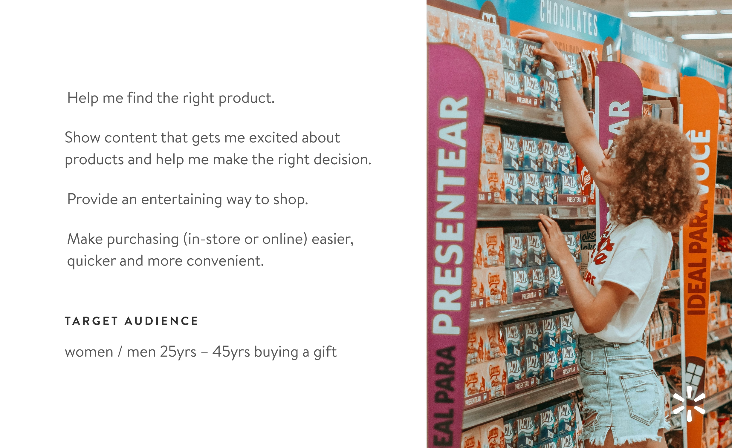
Walmart did not need another reason for shoppers to enter the toy department. It needed a better way to help the people already standing there make a purchase. A shopper might know the occasion but not the toy, find too little information on the package, or need an option beyond the local assortment. Endless Aisles had to make that decision easier without turning a quick store visit into a full ecommerce session on a large screen.
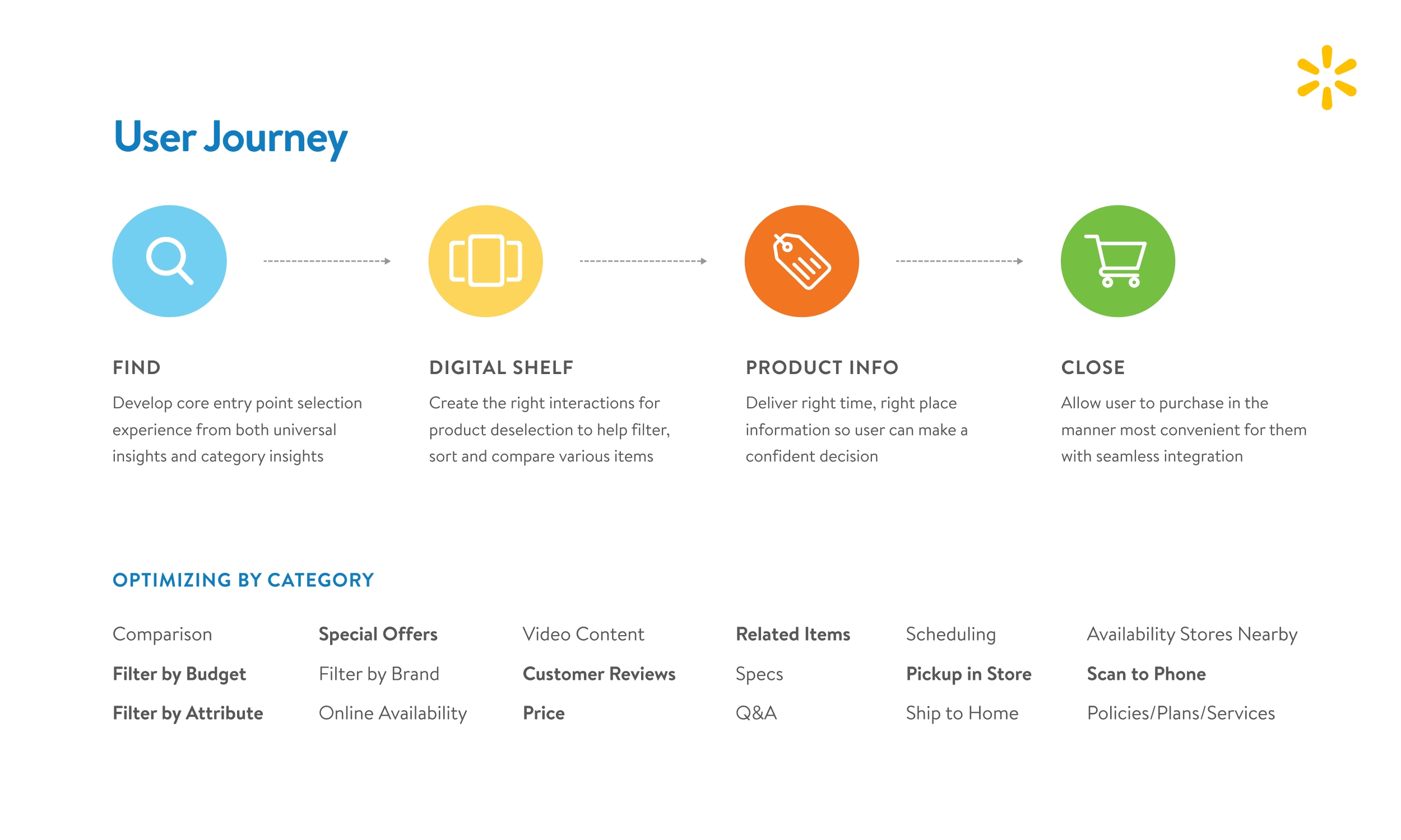
The larger idea was to extend every Walmart aisle with a shared digital foundation. Find created an entry point, the digital shelf narrowed the assortment, product detail supported the decision, and the final step connected shoppers to the store or Walmart app. Each department could keep that journey while adding its own questions, filters, and tools. Toys became the first proof of concept because it combined seasonal demand, adult gift shoppers, children, and products that often needed more explanation than the package could provide.
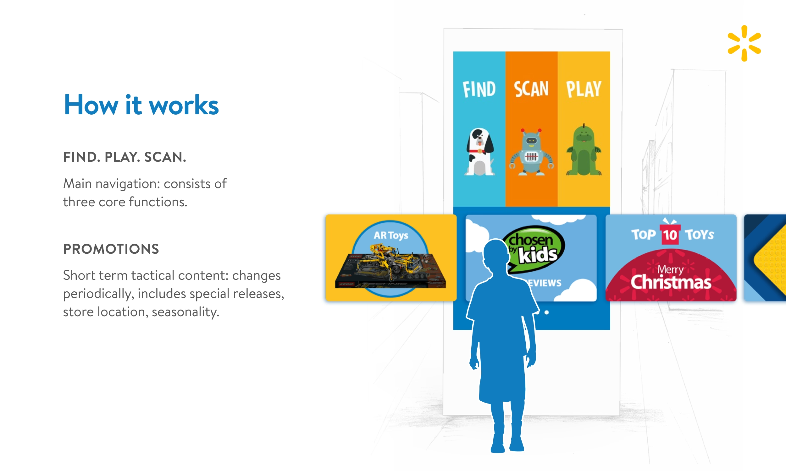


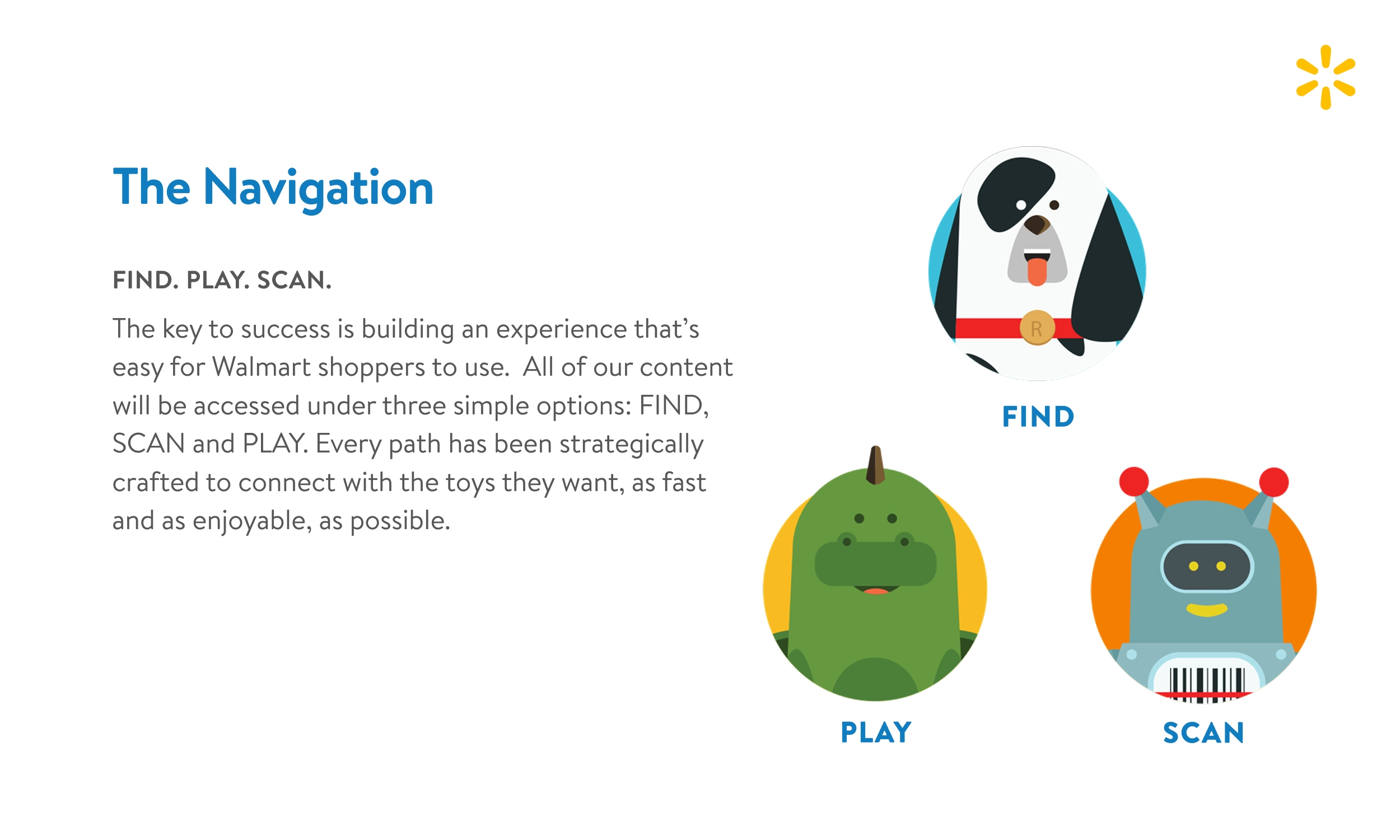
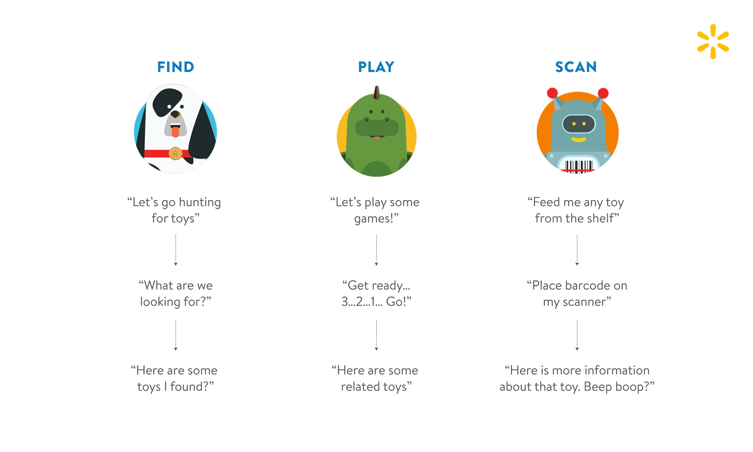
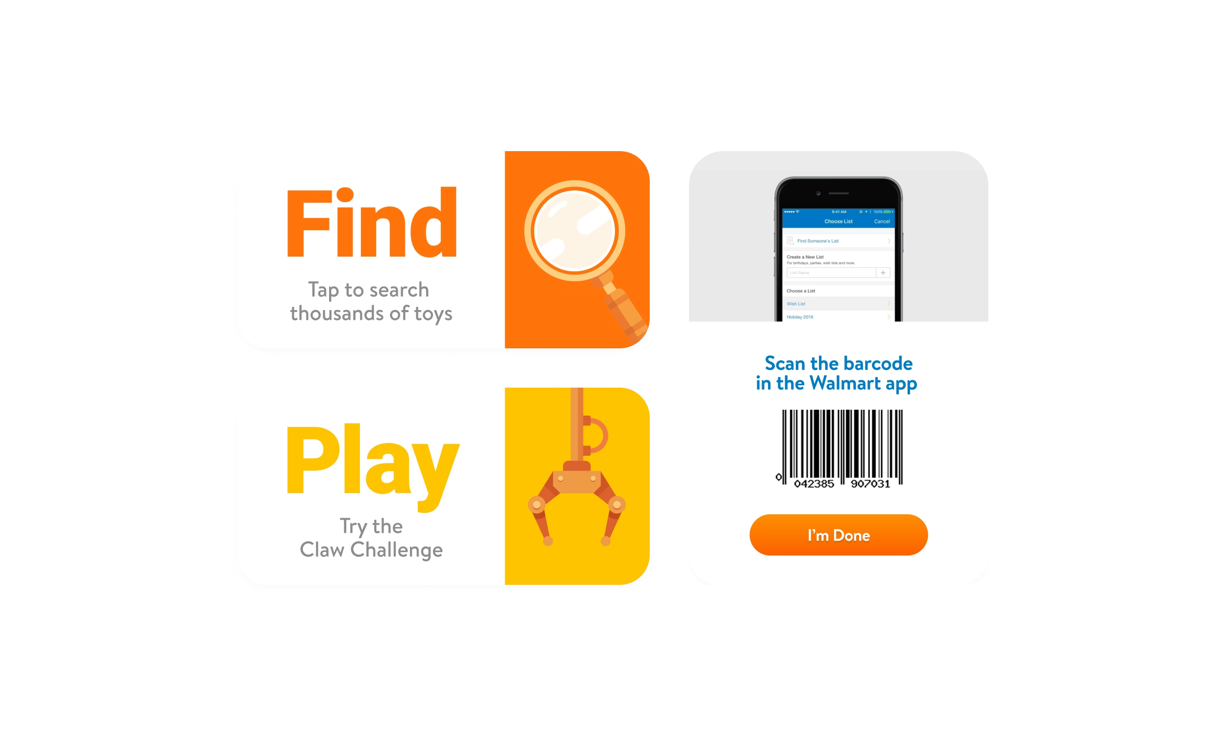
Toy shopping often put the buyer and the person influencing the purchase side by side. Adults needed guidance, availability, and enough product detail to feel confident. Children needed something immediate enough to notice and active enough to hold their attention. Early concepts presented Find, Scan, and Play as three equal entry points. The final home screen focused on Find and Play instead. Scan moved into the product journey, where it helped shoppers continue on their phones. Fewer choices gave each audience a clearer place to begin.
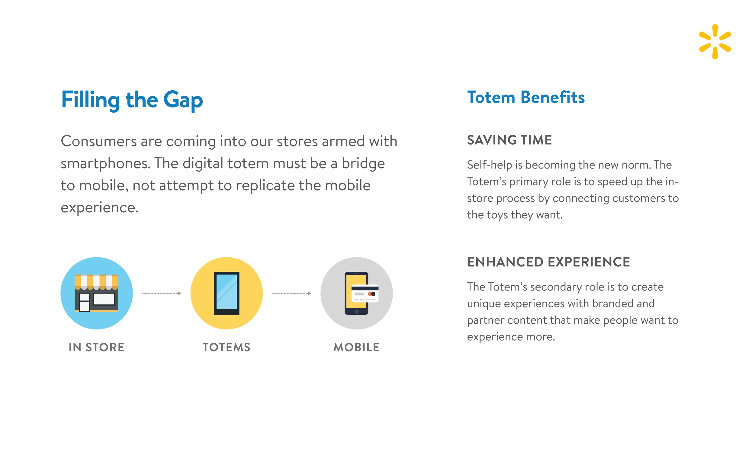
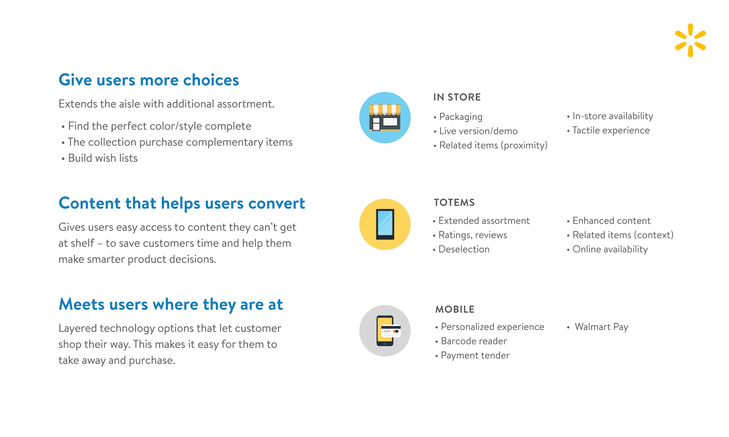
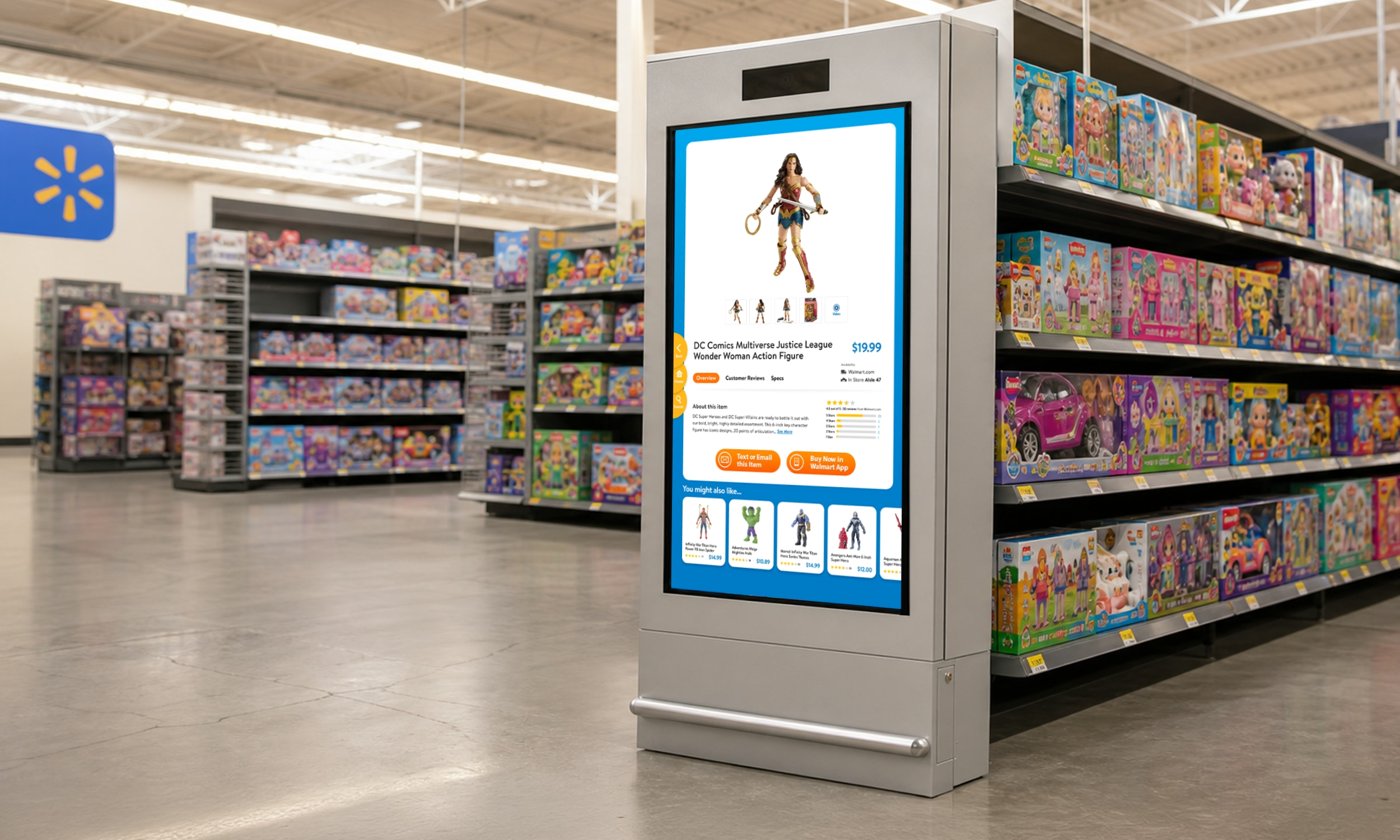
The shelf let shoppers hold the product and see what was available nearby. The kiosk added guided discovery, extended assortment, filters, reviews, video, and related products. The phone handled the personal next step. From a product page, shoppers could text or email an item to themselves or scan an on-screen code with the Walmart app. Giving each surface one clear role kept the kiosk from becoming a larger and slower version of Walmart.com.
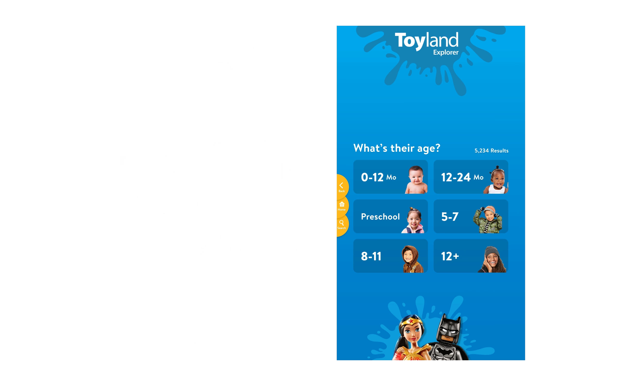
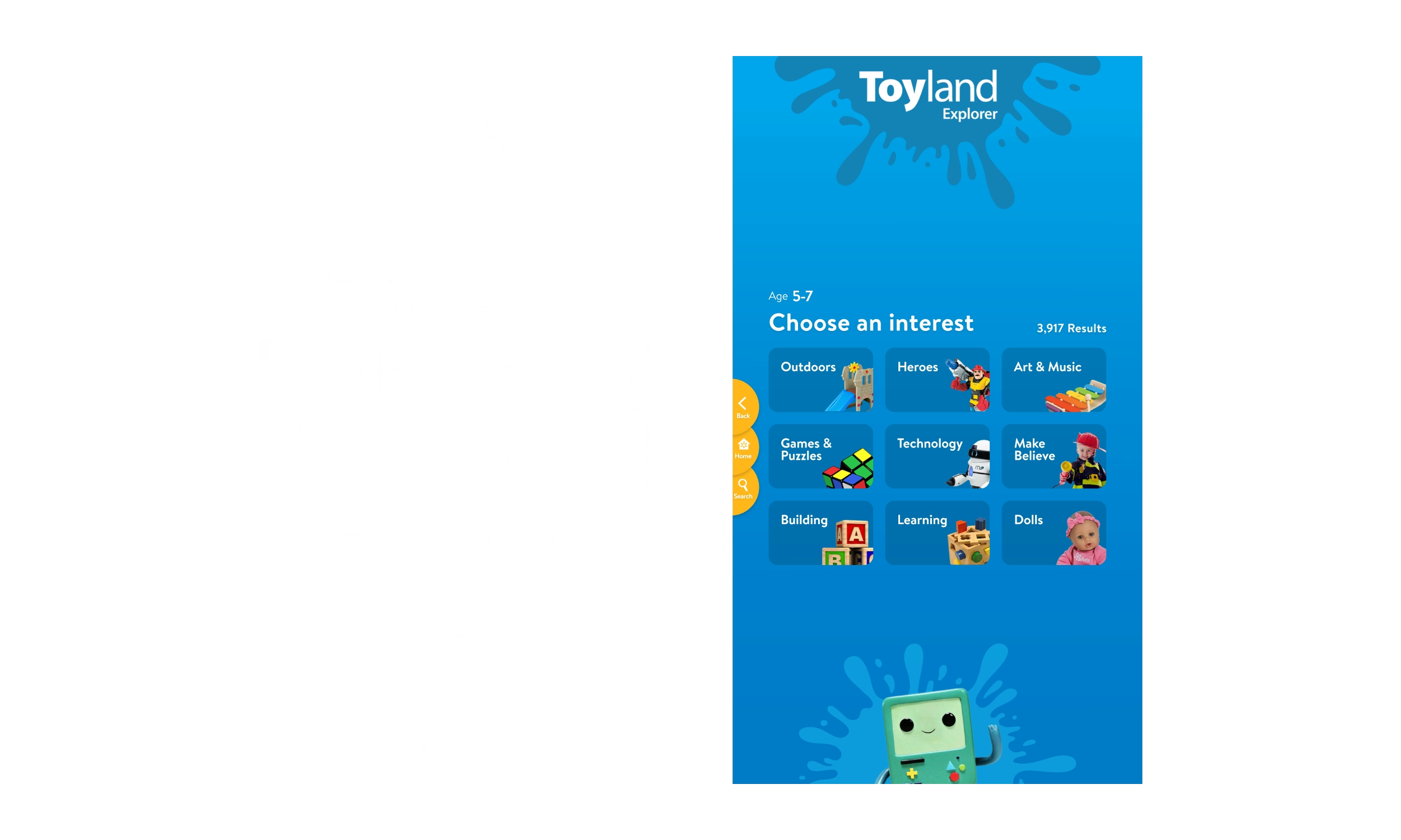
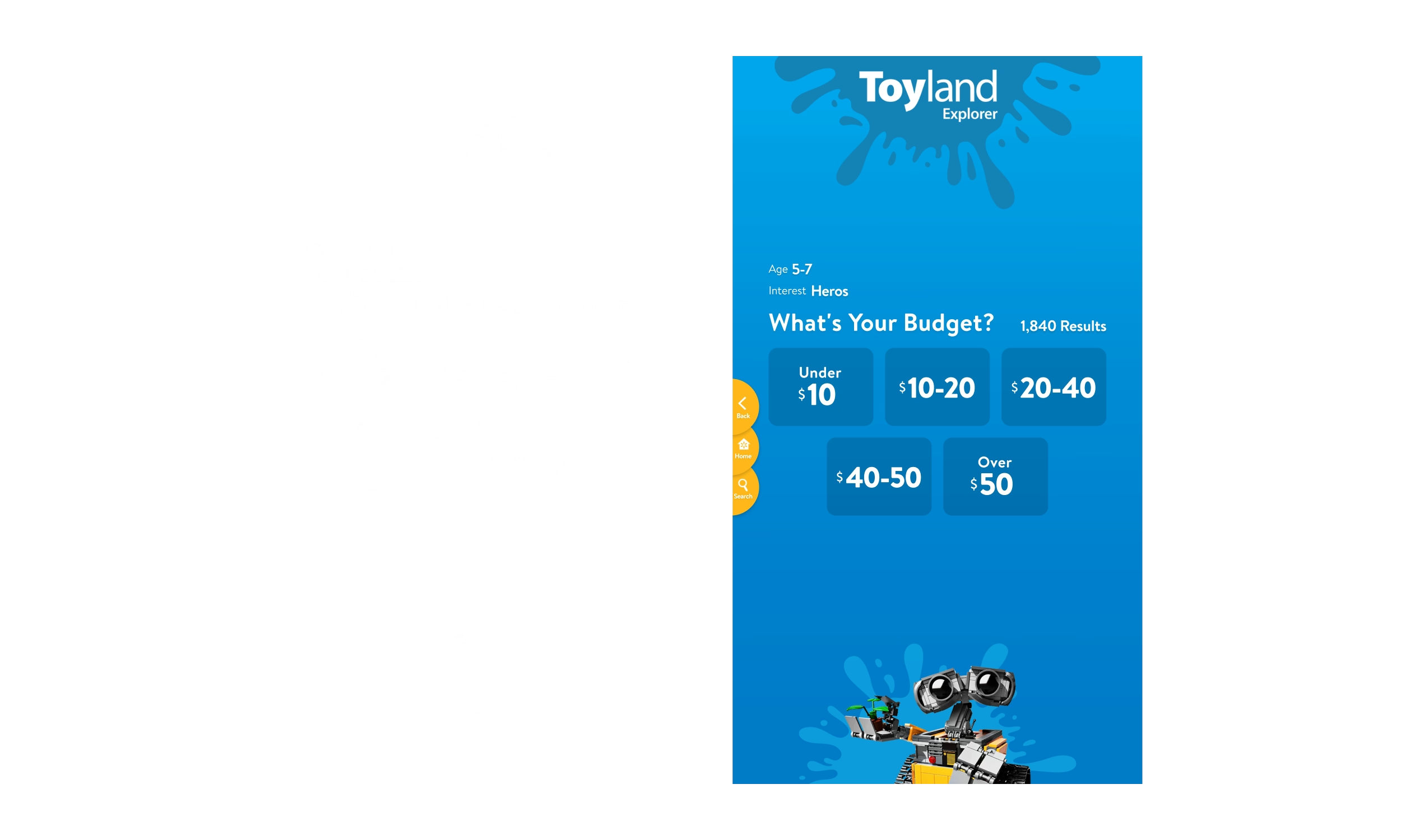
Parents often entered the toy aisle with a child on the way to a friend’s birthday party and no idea what to buy. The child did not always know what the friend wanted, and the parent was rarely familiar with the toys, characters, or trends that mattered to that age group. Find closed that knowledge gap with questions they could answer: the friend’s age, general interests, and the amount they wanted to spend. Each answer narrowed the assortment until an uncertain shopping trip became a manageable set of gift options.
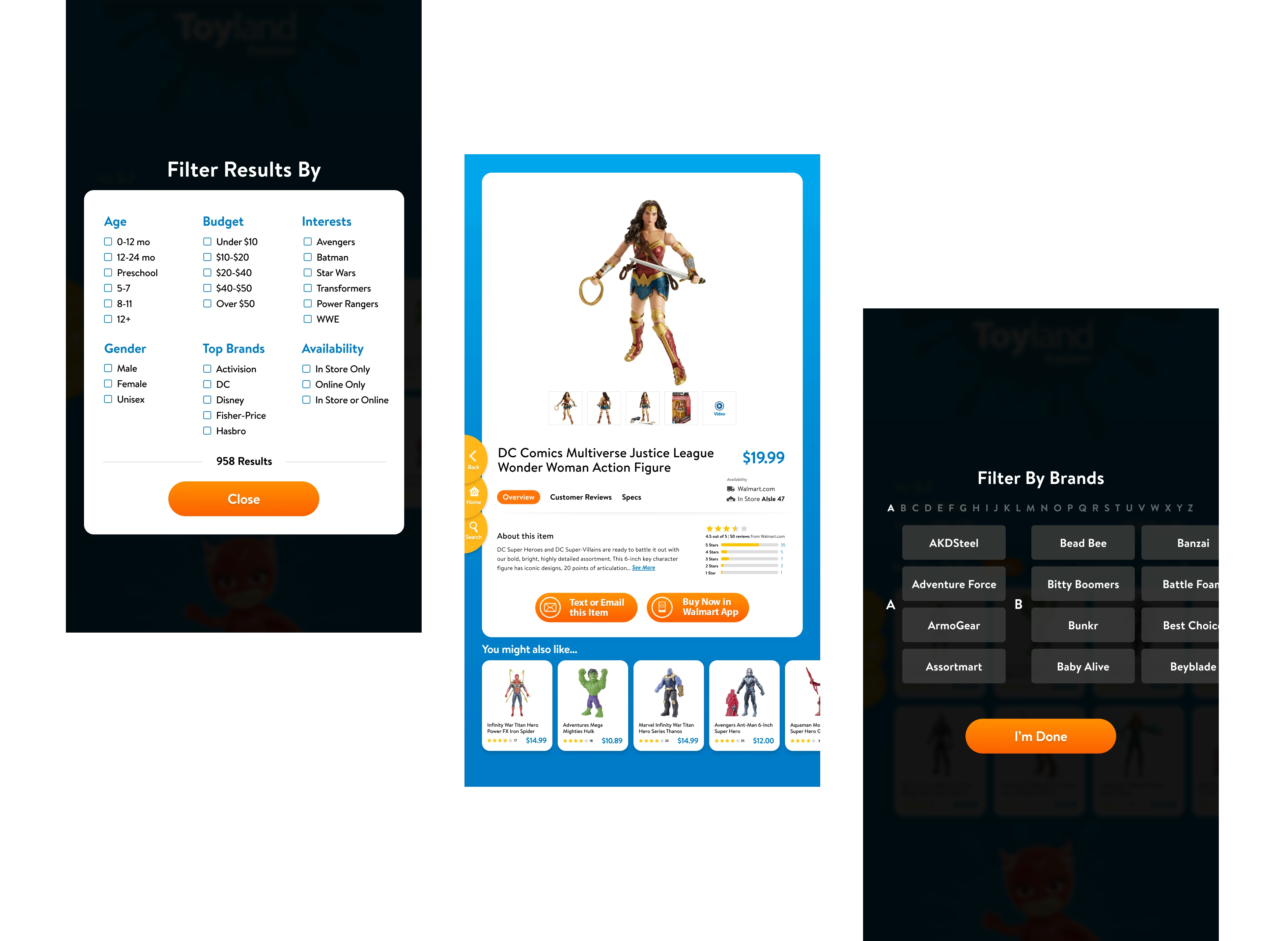
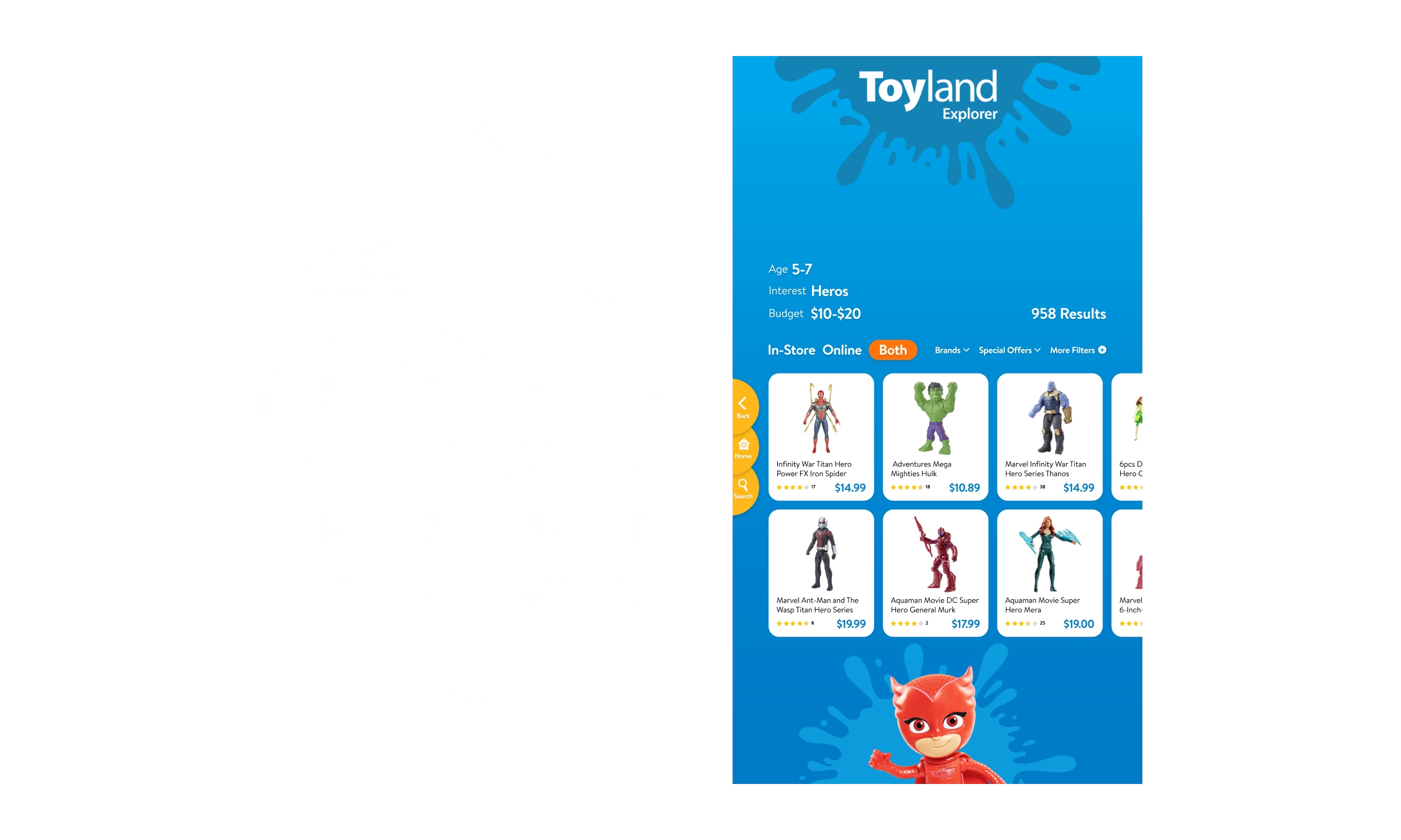
The resulting product list kept the shopper’s age, interest, and budget choices visible while adding availability, brand, offers, and additional filters. Product cards made price and ratings easy to compare. Product detail added images, video, reviews, specifications, related items, aisle location, and online availability. The goal was not to display the largest possible catalog. It was to provide enough context to remove the wrong choices and trust the one that remained.
Play gave children a reason to approach the kiosk, but attention alone did not support the retail goal. The team explored camera and motion concepts before developing a Kinect-controlled Claw Challenge. Children used body movement to control an on-screen claw, creating an interaction that belonged to the physical installation. The experience could then return to relevant toys and product discovery. Play earned its place by holding a child’s attention while keeping a path back to merchandise.
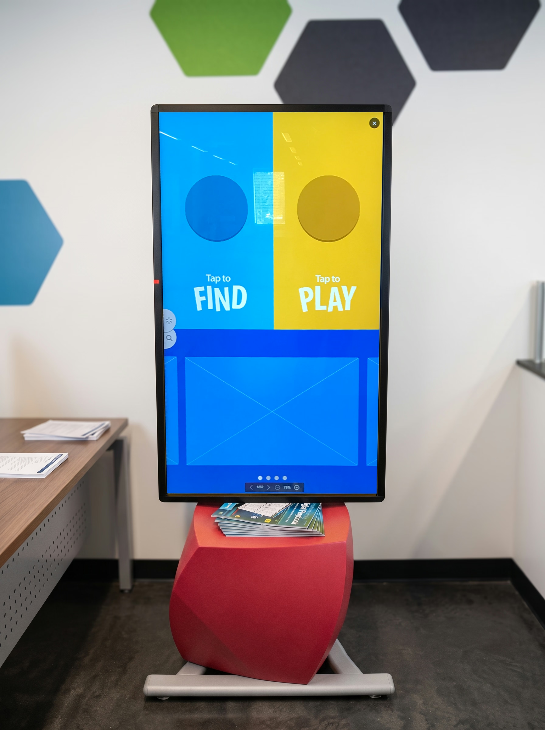
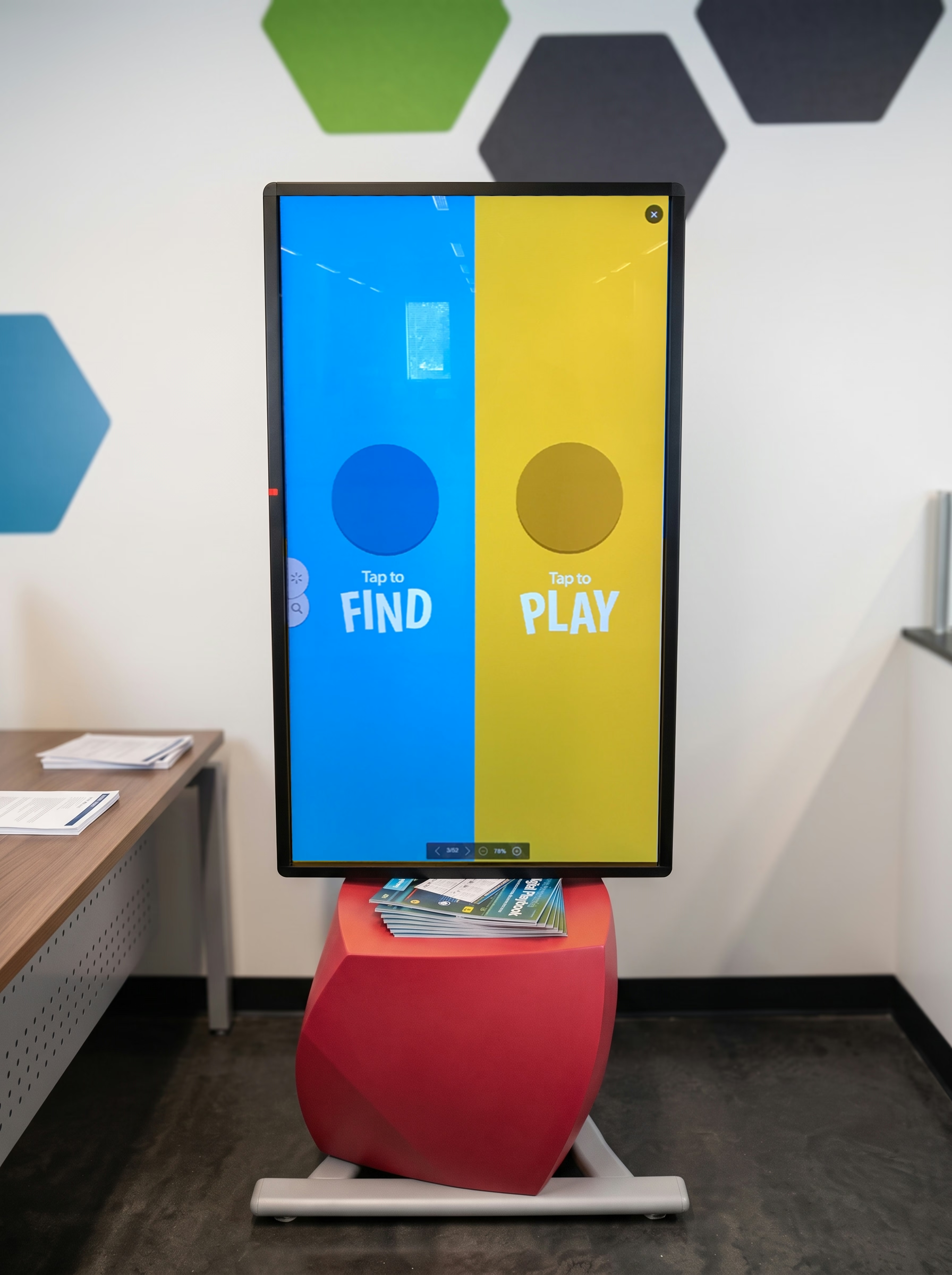
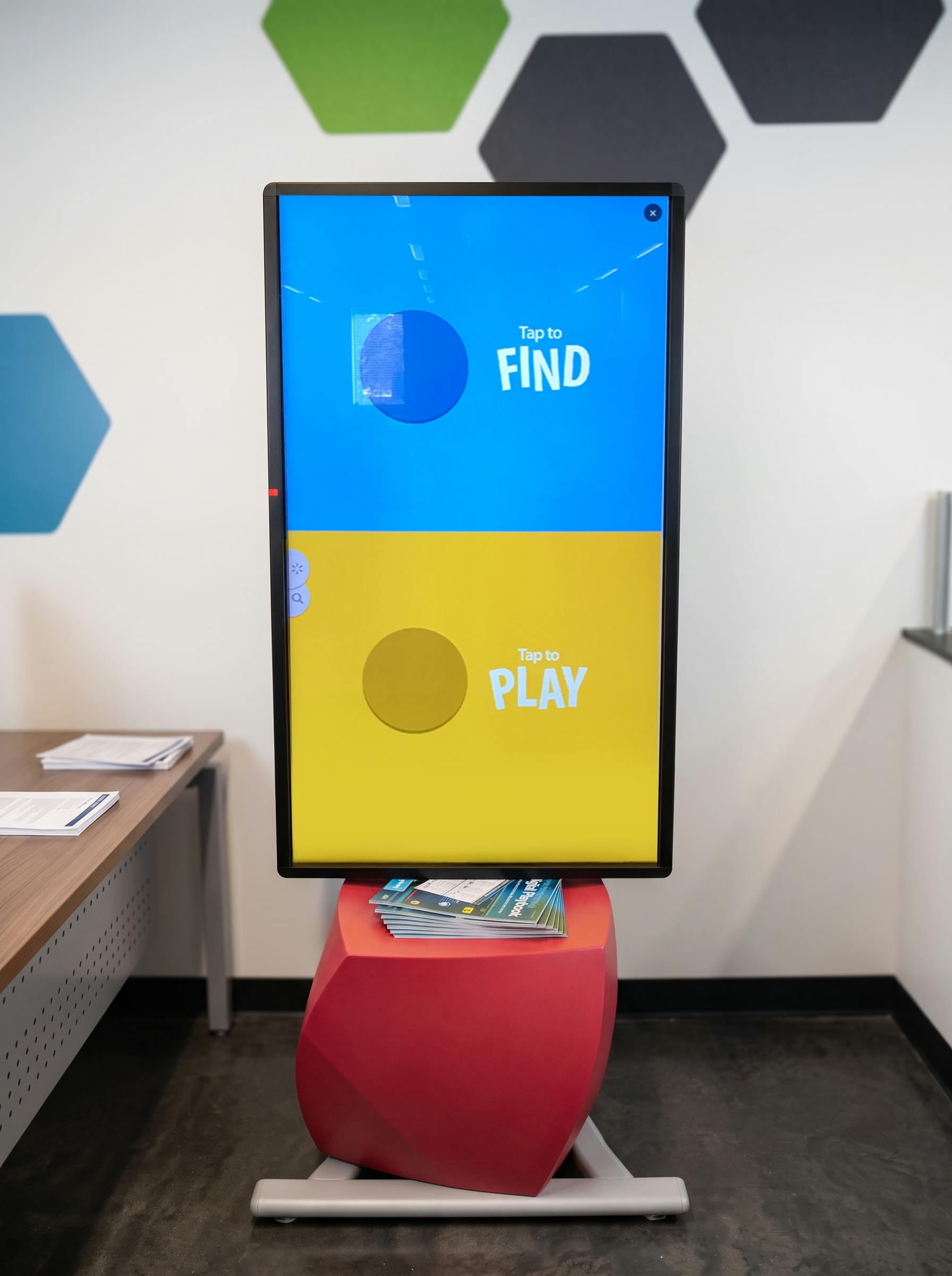
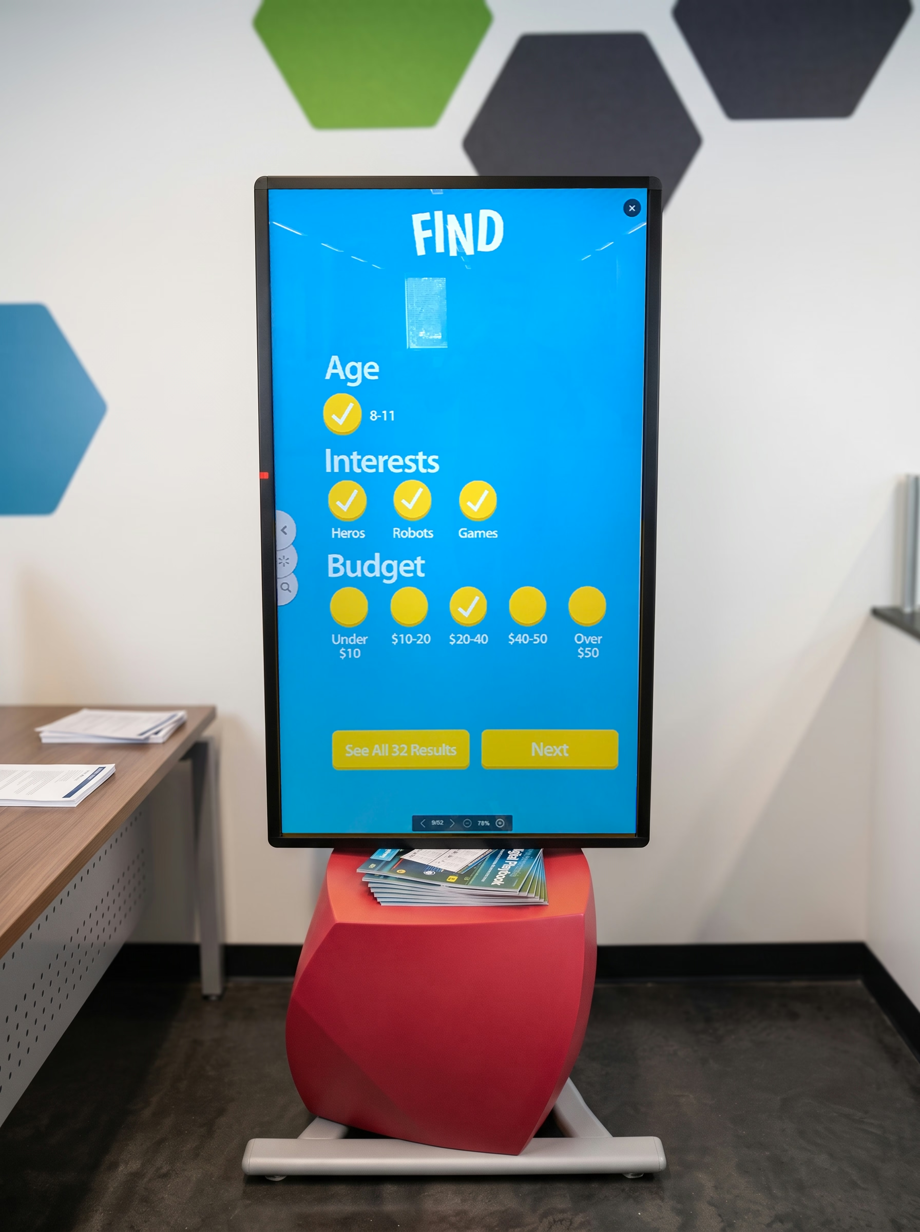
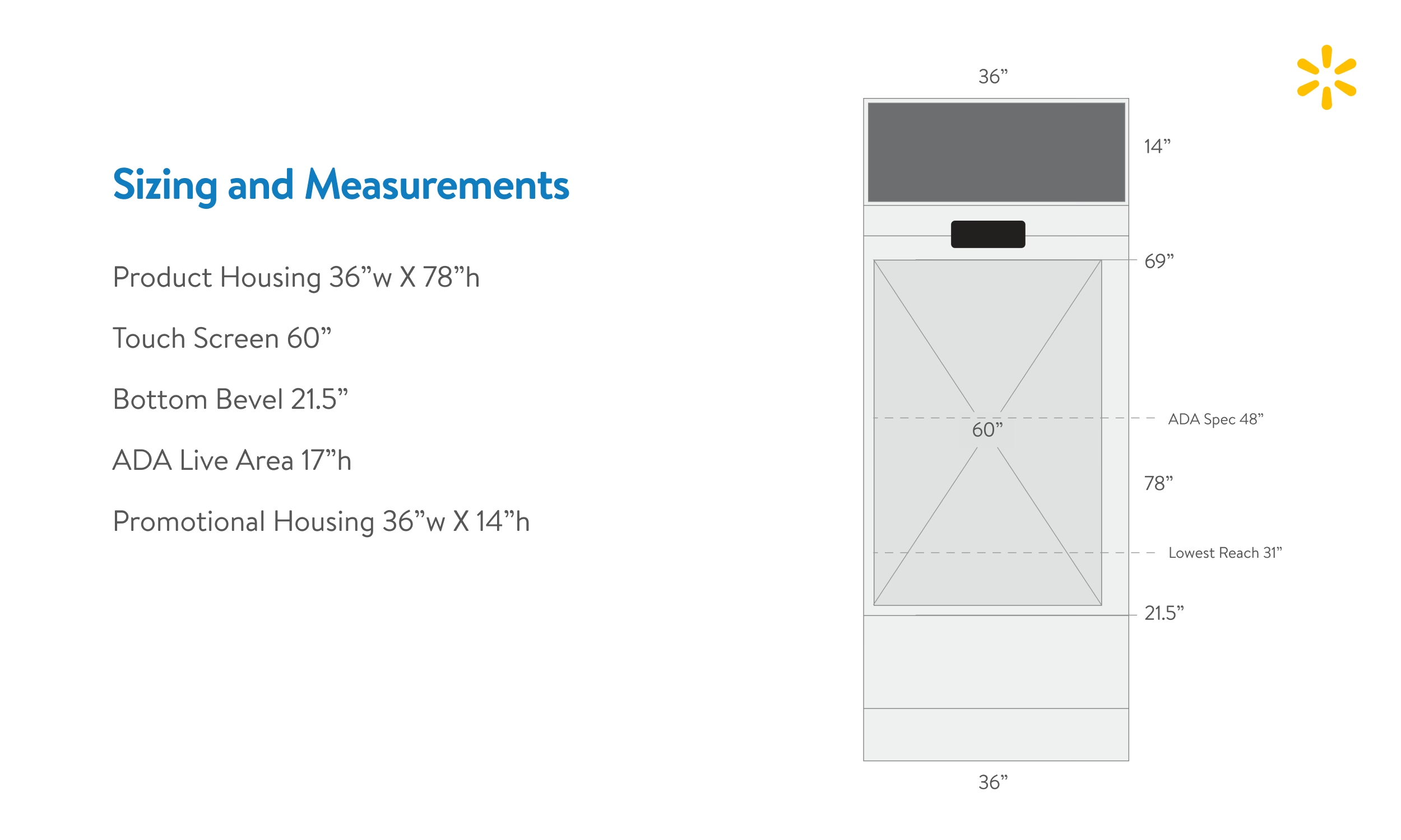
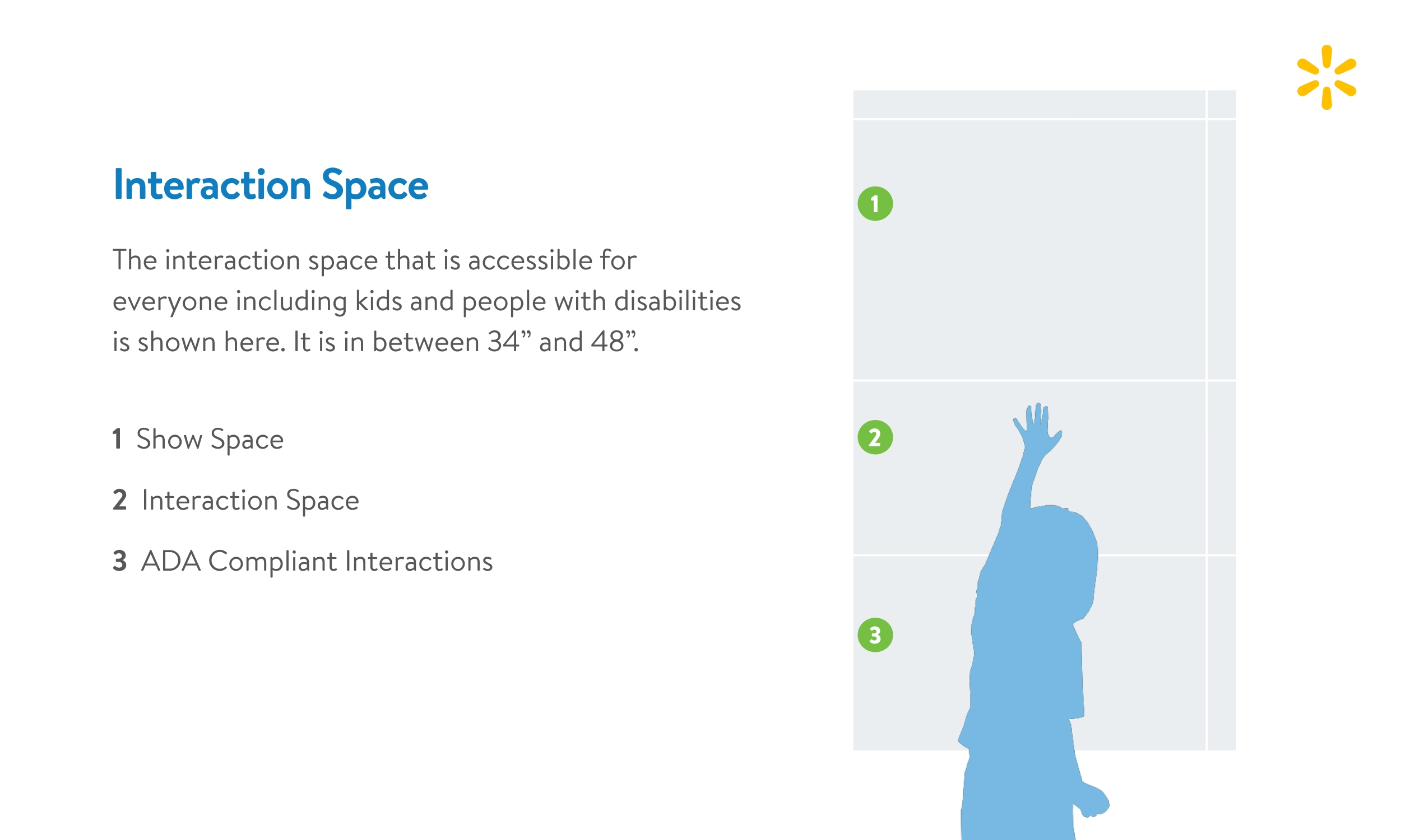
The interface lived inside a fixture, not a browser window. Touch height, reach, viewing distance, children, wheelchair access, camera position, and the surrounding merchandise all affected the design. I developed a working prototype on a Raspberry Pi and ran it on a full-scale portrait display. We tested it with user groups to understand how people approached Find and Play, moved through the guided flow, and interacted with the screen at full scale. Those sessions helped us refine the experience before Toyland Explorer entered a Walmart aisle.
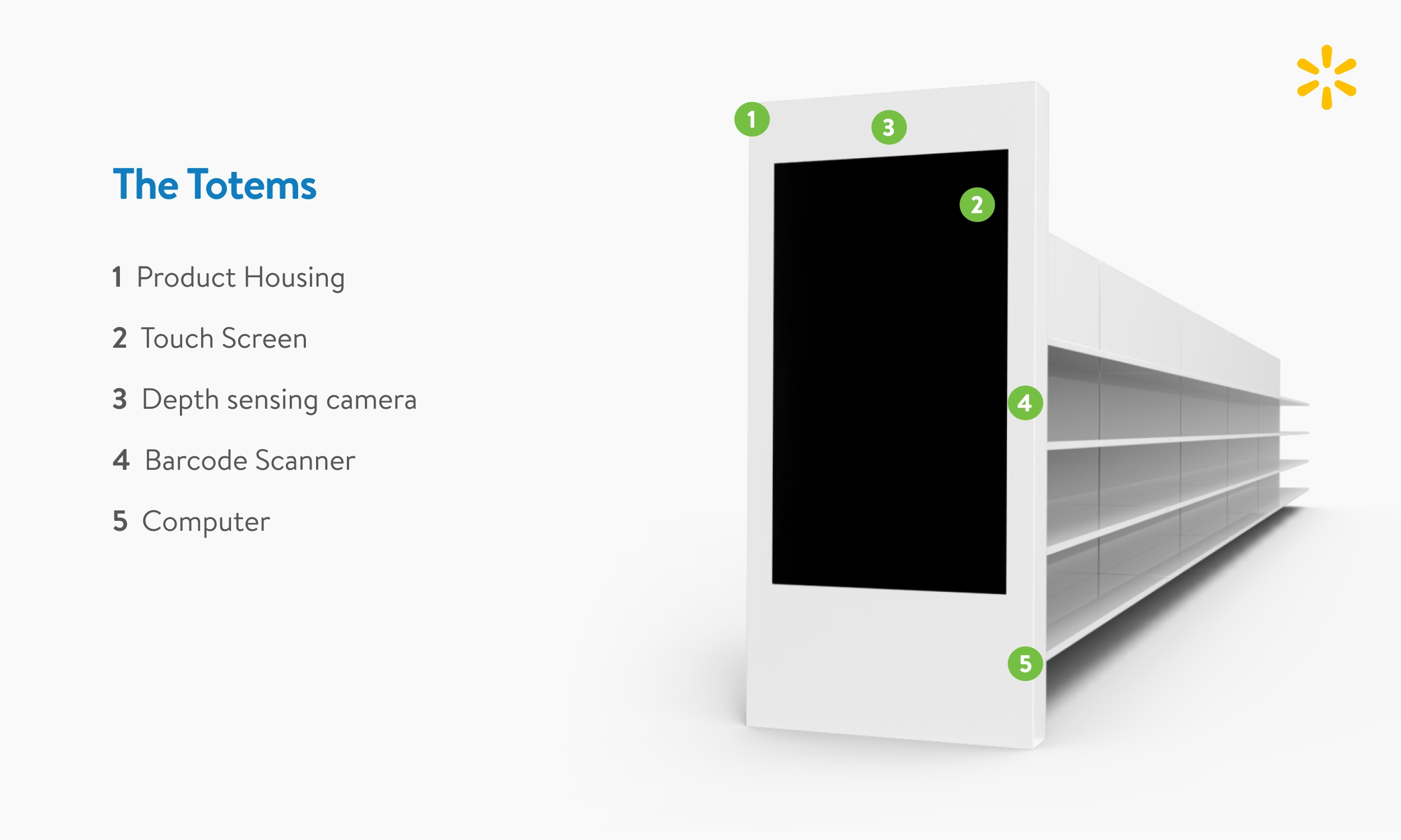
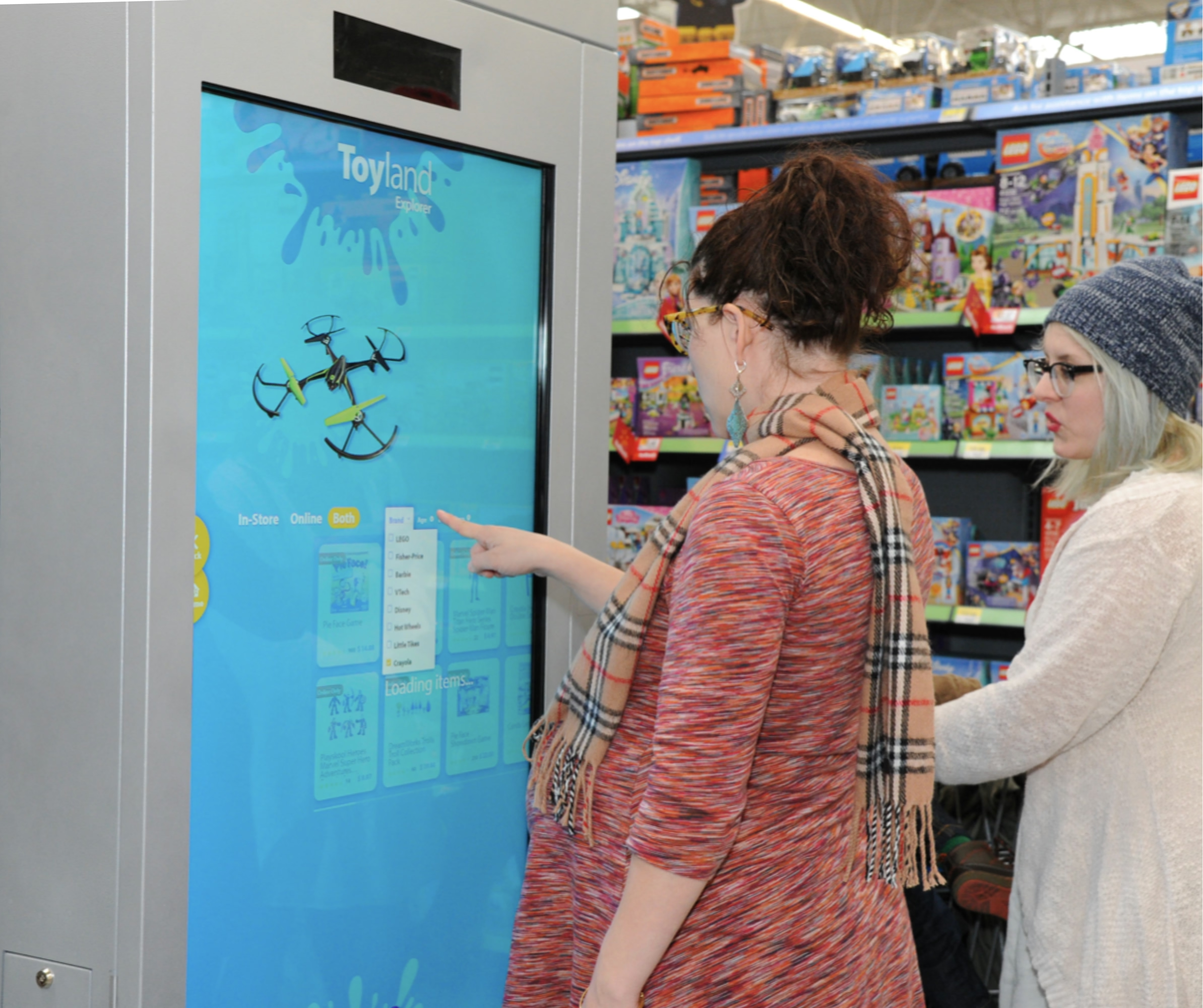
The store was where the platform had to prove that guided discovery, product information, Play, and the Walmart app could work as one experience without constant associate support. Toyland Explorer went live in roughly a dozen pilot stores, giving Walmart a working proof of concept for a platform intended to extend across departments. The pilot showed that one shared journey could support new category logic without starting over each time. It did not test the operating model at chain-wide scale because the broader rollout did not happen.
.svg)