High Altitude
Zero Ambiguity
(Info)
Client
BendixKing
/
Honeywell
Category
UI & UX
/
Physical Device
Duration
Products
Interaction Model
Validated By
Role
Lead Designer / Design Engineer
Focus
UX & UI / Systems Design
Scope
Physical Device / Digital Simulator
Outcome
FAA-certified, shipped
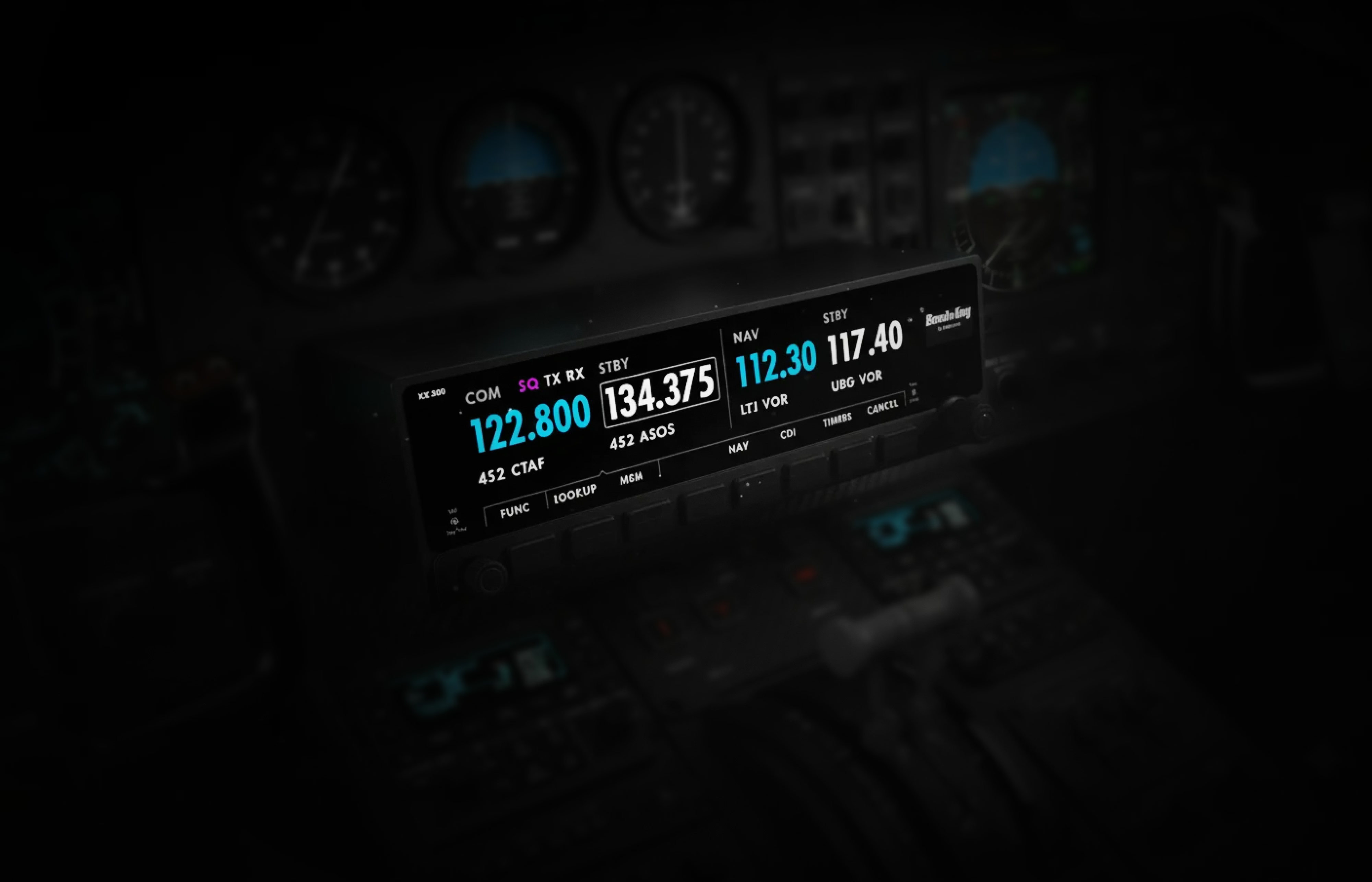
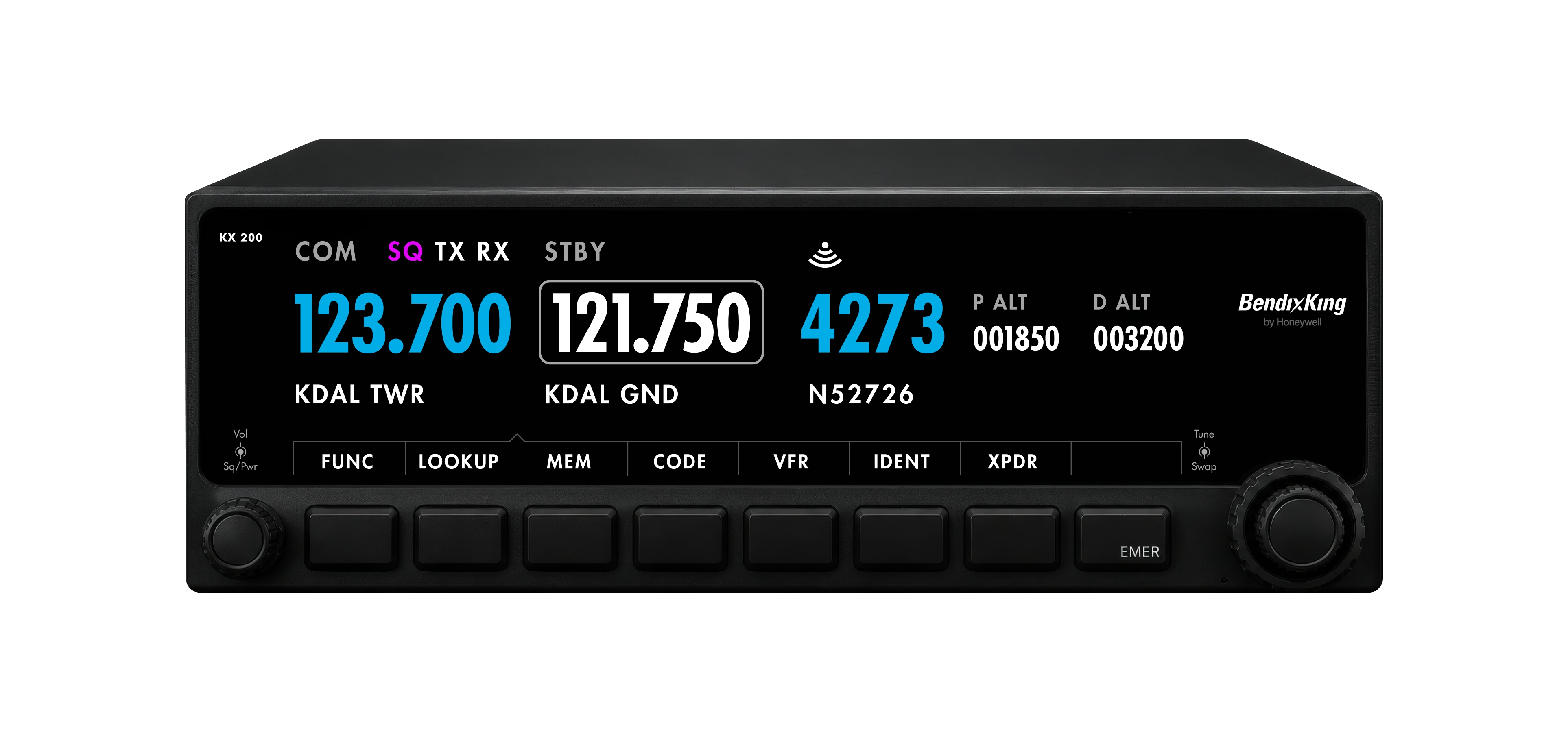
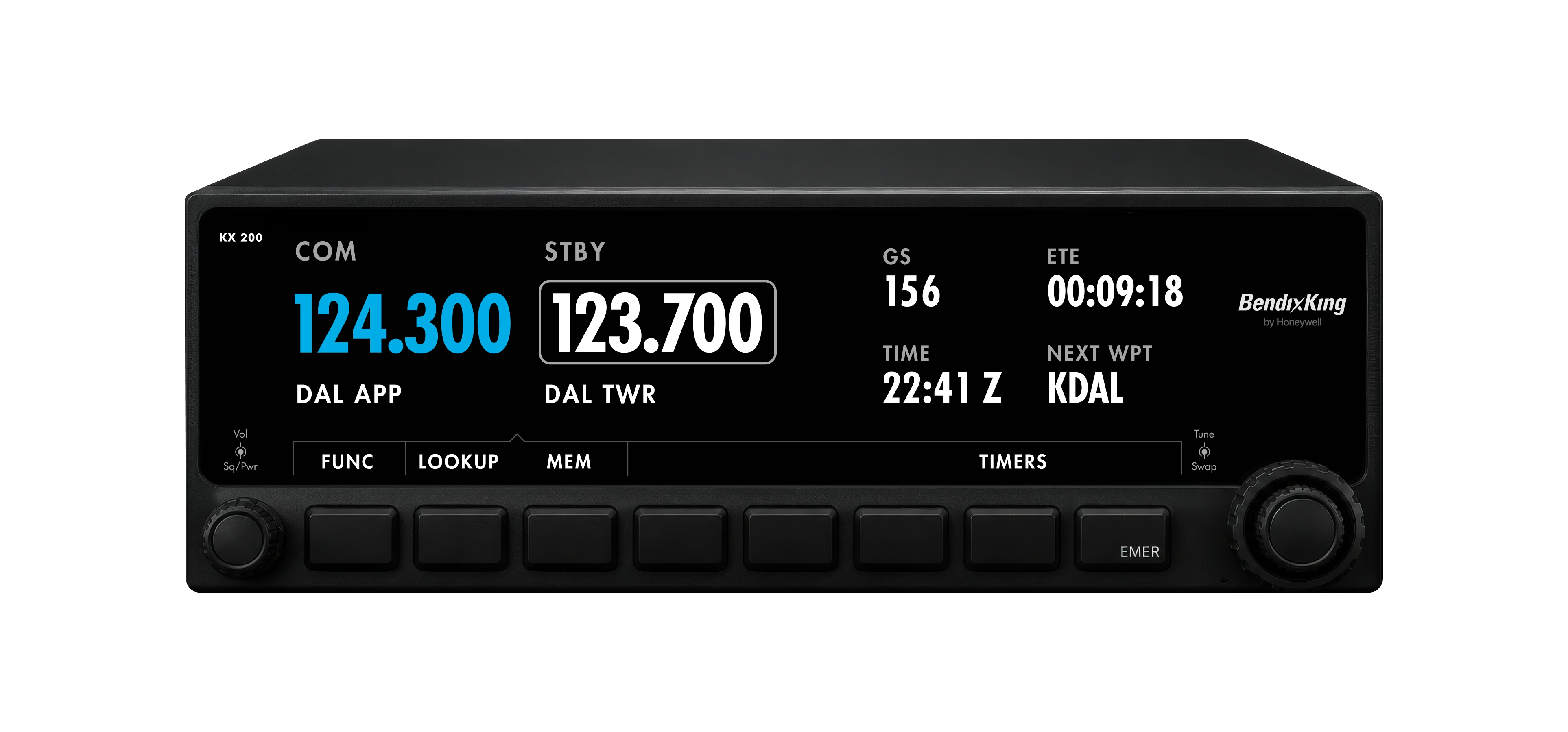
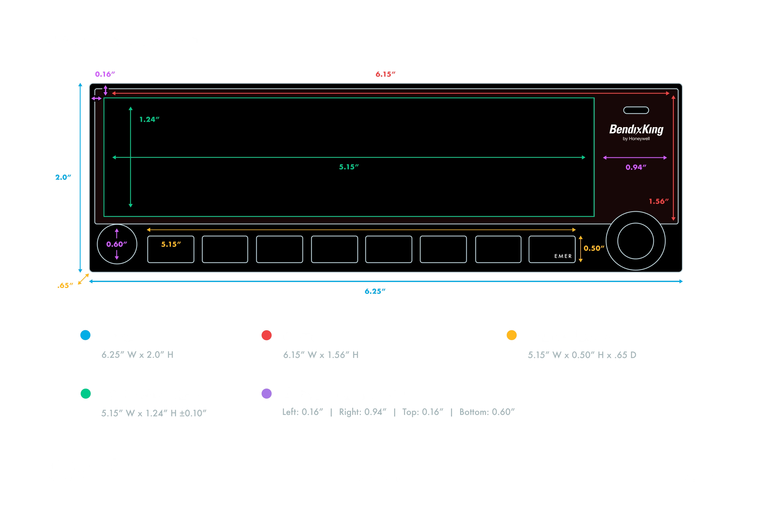
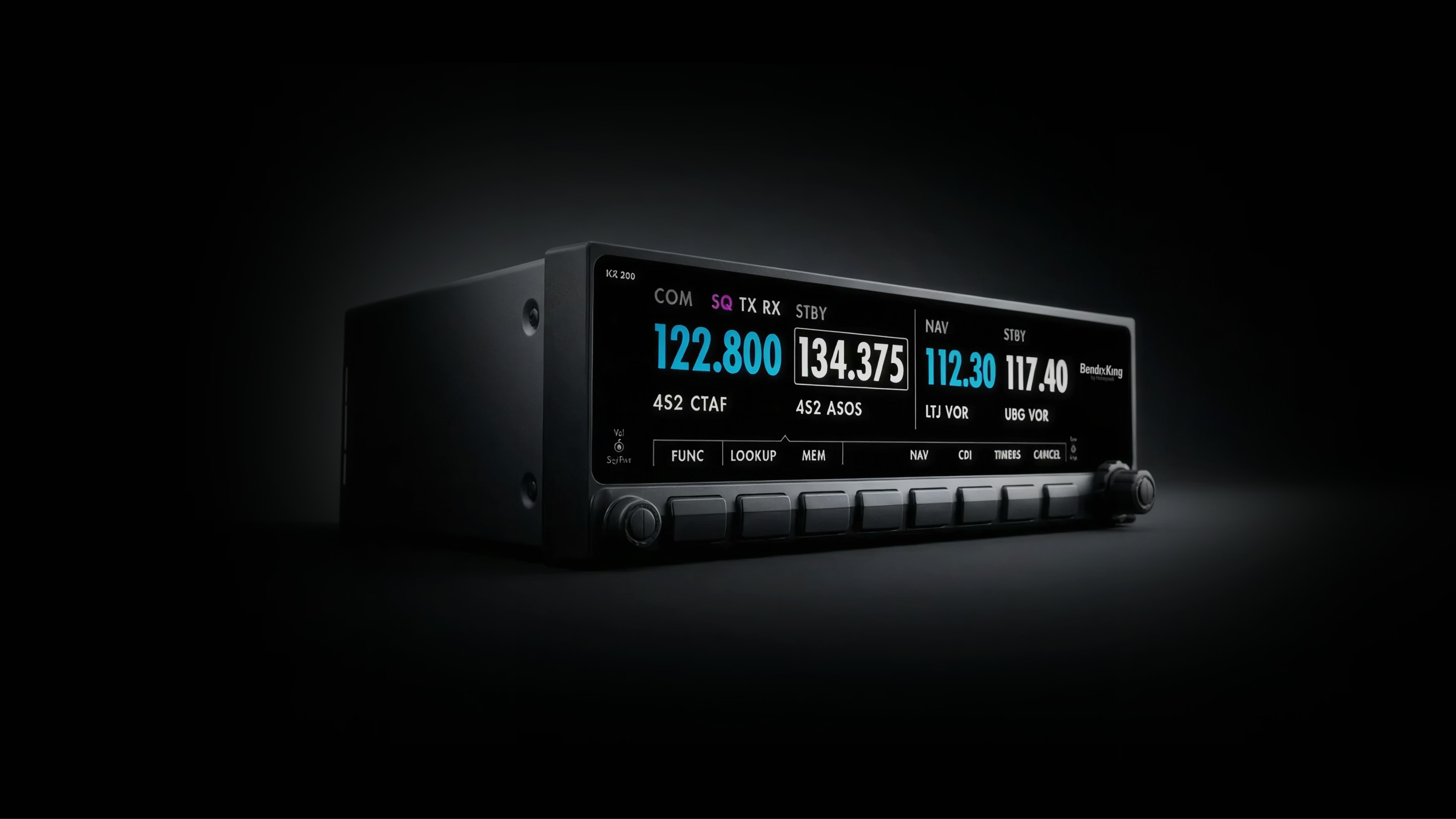
The KX 200 was not a screen assignment. It was a cockpit logic problem disguised as an interface. BendixKing was replacing radios and transponders that had been in service since the 1980s, equipment some pilots had flown behind for thirty years, and the replacement had to add database lookup, memory storage, integrated transponder management, and flight data without growing the panel cutout. The usable display measured 5.15 by 1.24 inches. Smaller than a Post-it note, and every state the system could enter had to resolve inside it.

Designing an avionics interface from a desk is one thing. Understanding it from the cockpit is another. I took flying lessons during the KX 200 project because the screen had to work with the pilot’s mental load, hand position, dial placement, radio timing, landing sequence, and emergency behavior, not apart from them. What that taught me was physical: why a bright display at eye level blinds you on a late-afternoon approach, why you need to feel encoder detents without looking when the air is rough, and why pilots memorize frequencies instead of looking them up when workload spikes. Font weight, button spacing, and encoder resistance stopped being visual decisions.
The KX 200 inherited the physical trust of the KY196B: fast frequency control, tactile repetition, and behavior pilots already knew under pressure. But it had to serve two populations at once. Pilots raised on mechanical BendixKing radios expected direct manipulation and memorizable sequences. Pilots raised on glass cockpits like the Garmin G1000 expected menus, database lookup, and progressive disclosure. The interface had to feel native to both without alienating either, which meant preserving the old cockpit rhythm and then extending it through softkeys, encoders, menus, and digital states without making anyone relearn what already worked.
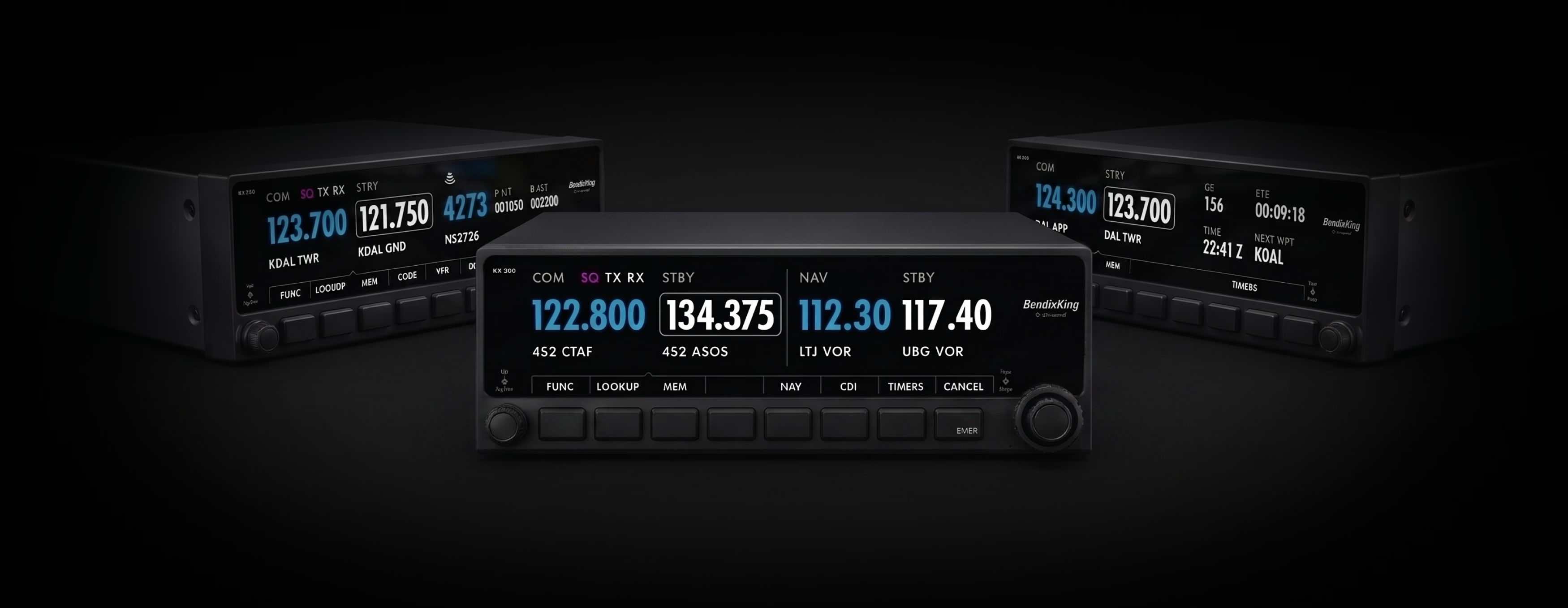
COM, COM/NAV, and COM/Transponder configurations all ran through one shared chassis and one shared hardware language. Each added different capability, but the pilot-facing logic stayed consistent across softkeys, rotary inputs, menus, alerts, editable fields, confirmation states, and fallback behavior. Learn one and you understood the others. The same interaction system later carried into the KLN 95 GPS Navigator and its far heavier workflows, flight planning, waypoint management, and approach procedures, which is the real test of whether an interaction model is a system or just a layout. What we deliberately did not do was add touch. Gloved hands, turbulence, and panel ergonomics made physical encoders the correct answer rather than the nostalgic one.
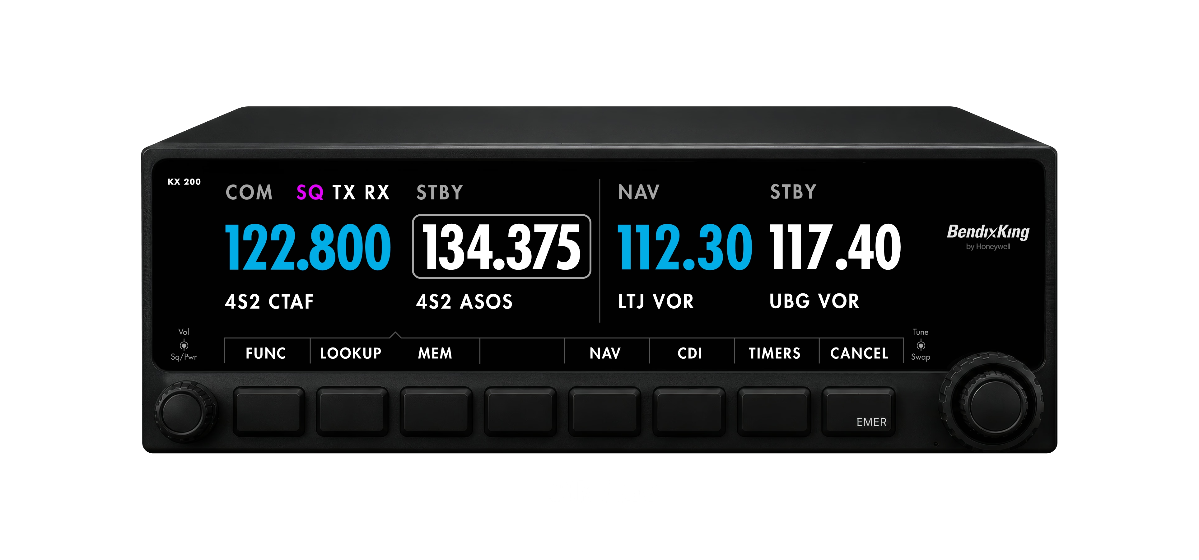


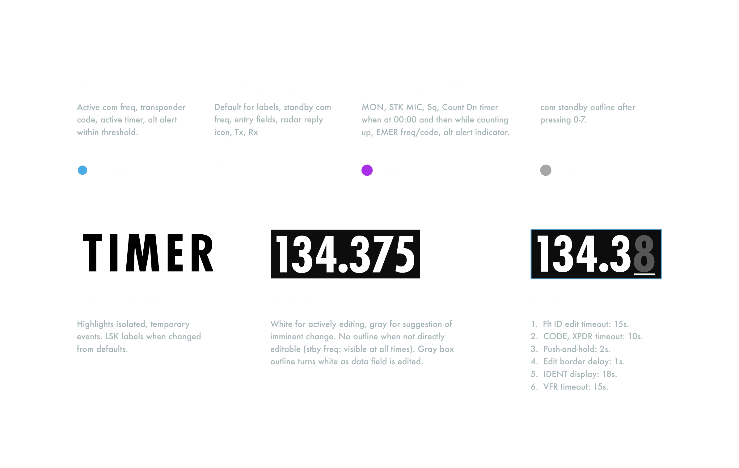
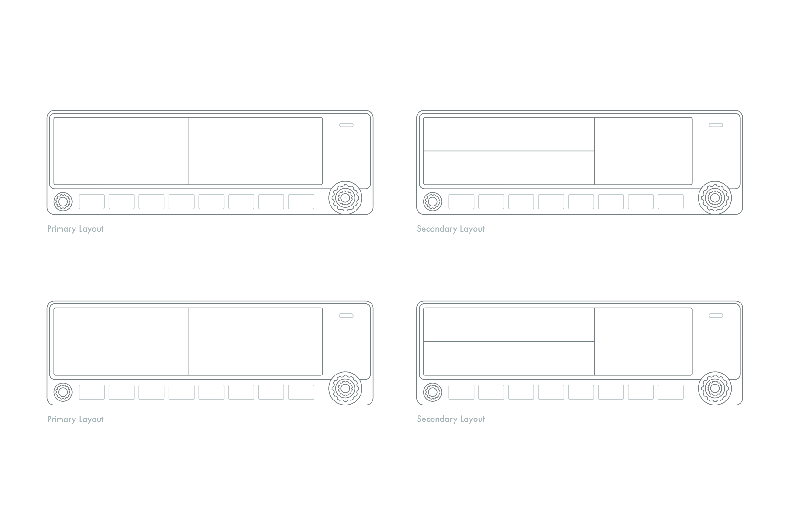
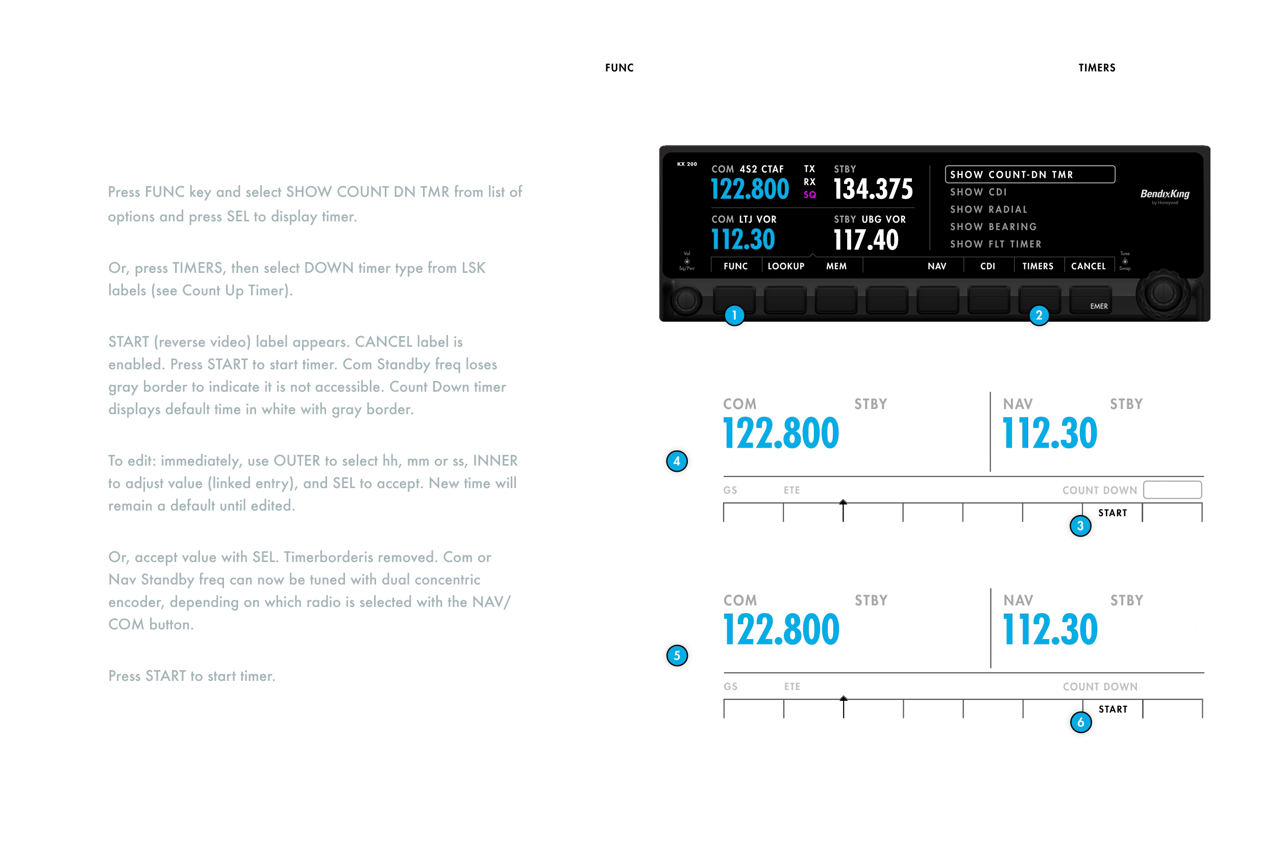
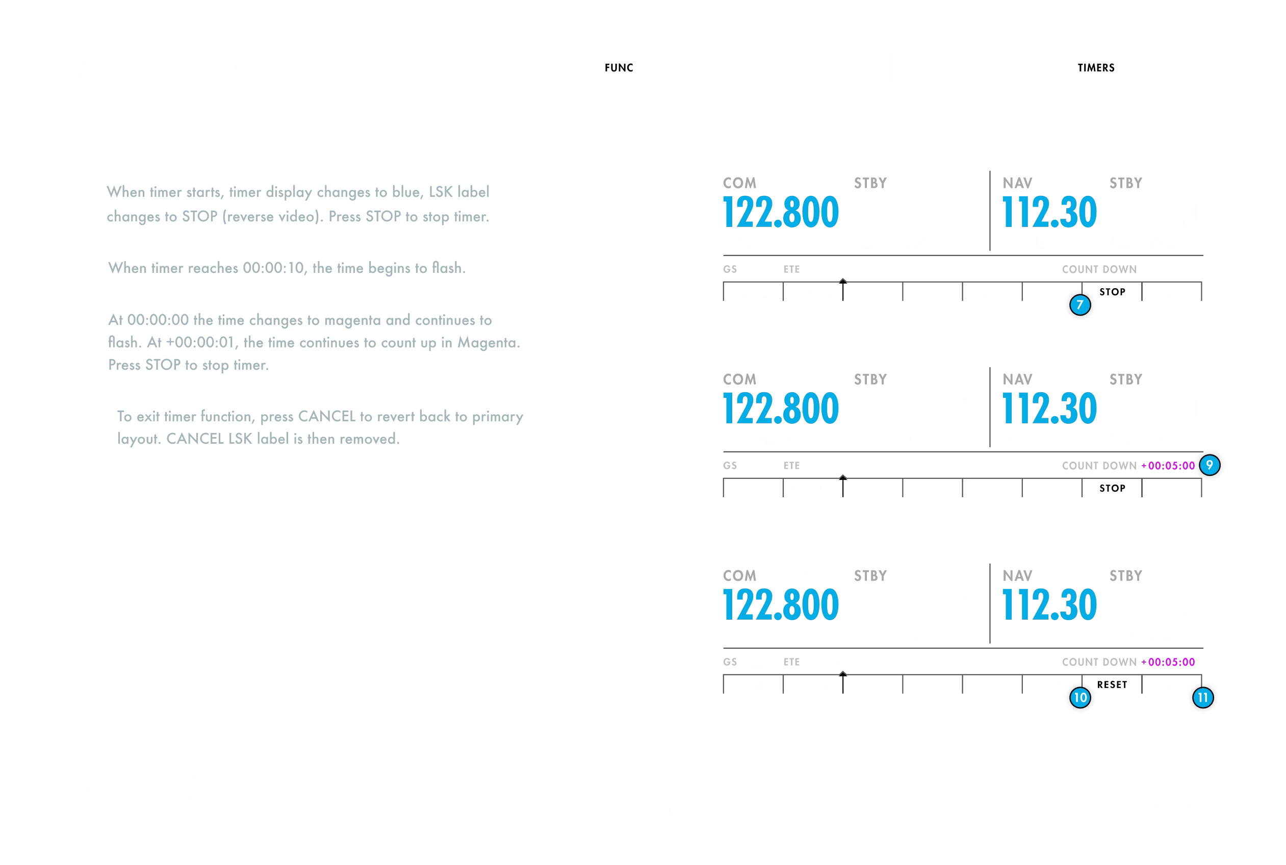
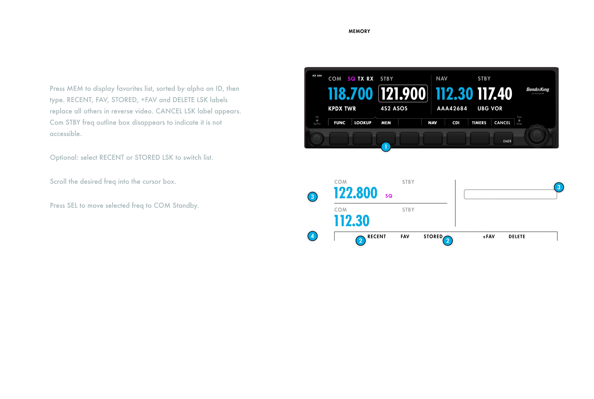
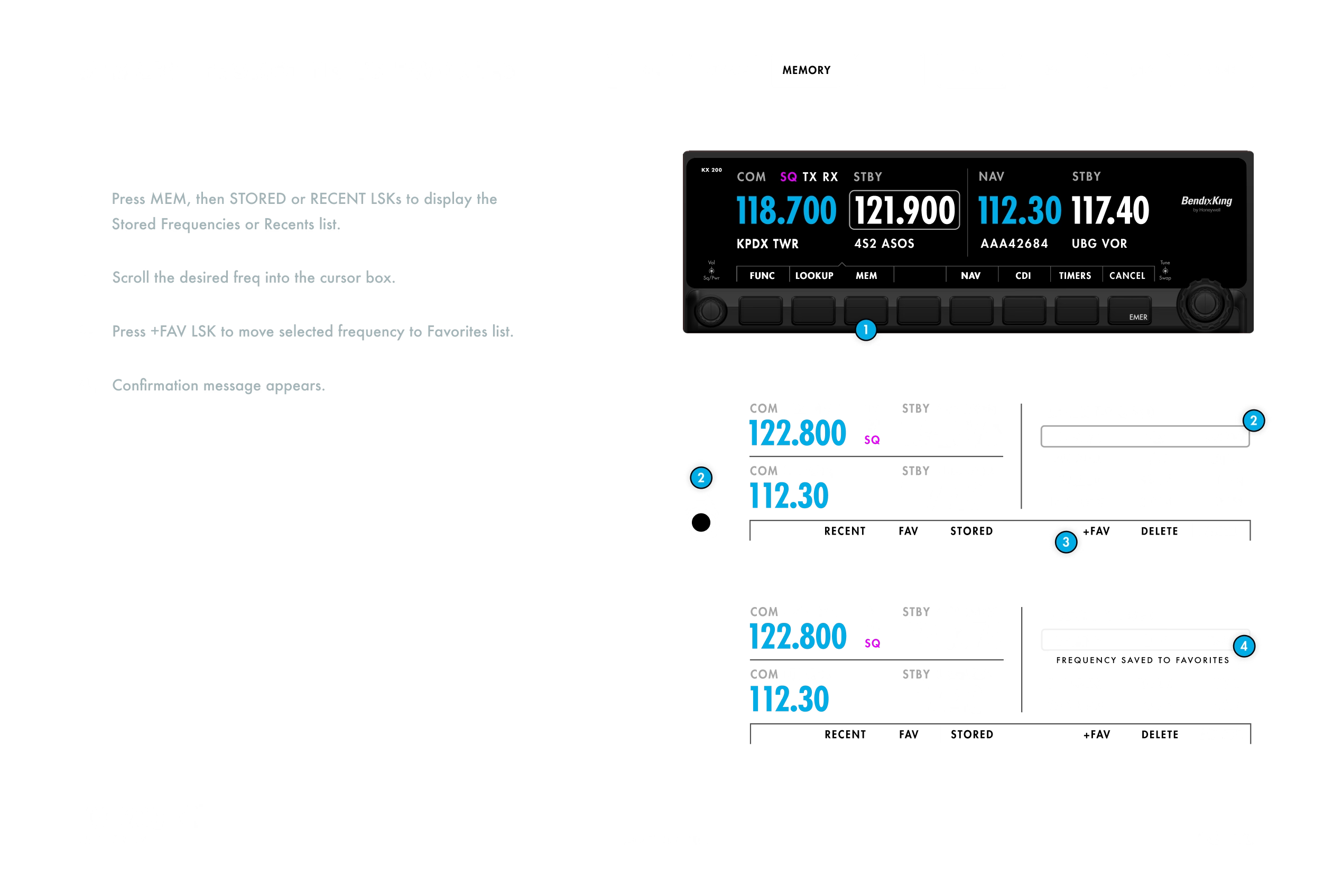
The product specification turned the interface into a system of rules. Input was deliberately narrow, dual concentric encoders and eight line-select keys whose labels changed with context, so a single button press could change a label, start a timer, enter a temporary mode, or be interrupted by an alert, and every one of those states had to resolve predictably across modes. Every screen, dial, label, and fallback behaved like one cockpit language.
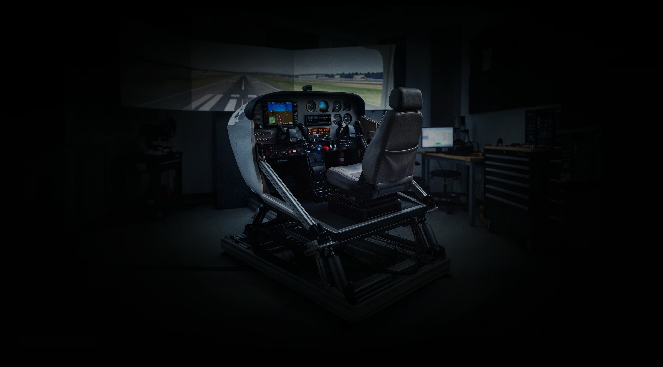
The KX 200 could not be validated through static UI alone. I pushed for a simulator-based model and built the first working prototype: a web application wired to the real hardware, dual concentric encoders, line-select keys, and the emergency button, so rotation, press, and long-press timing drove actual interface state. We 3D-printed the bezel, mounted it at true panel height in a cockpit simulator, and ran departure sequences under turbulence with ATC audio in the headset. It was not a clickable mockup. It was a running specification, and engineering received it as working code rather than wireframes.
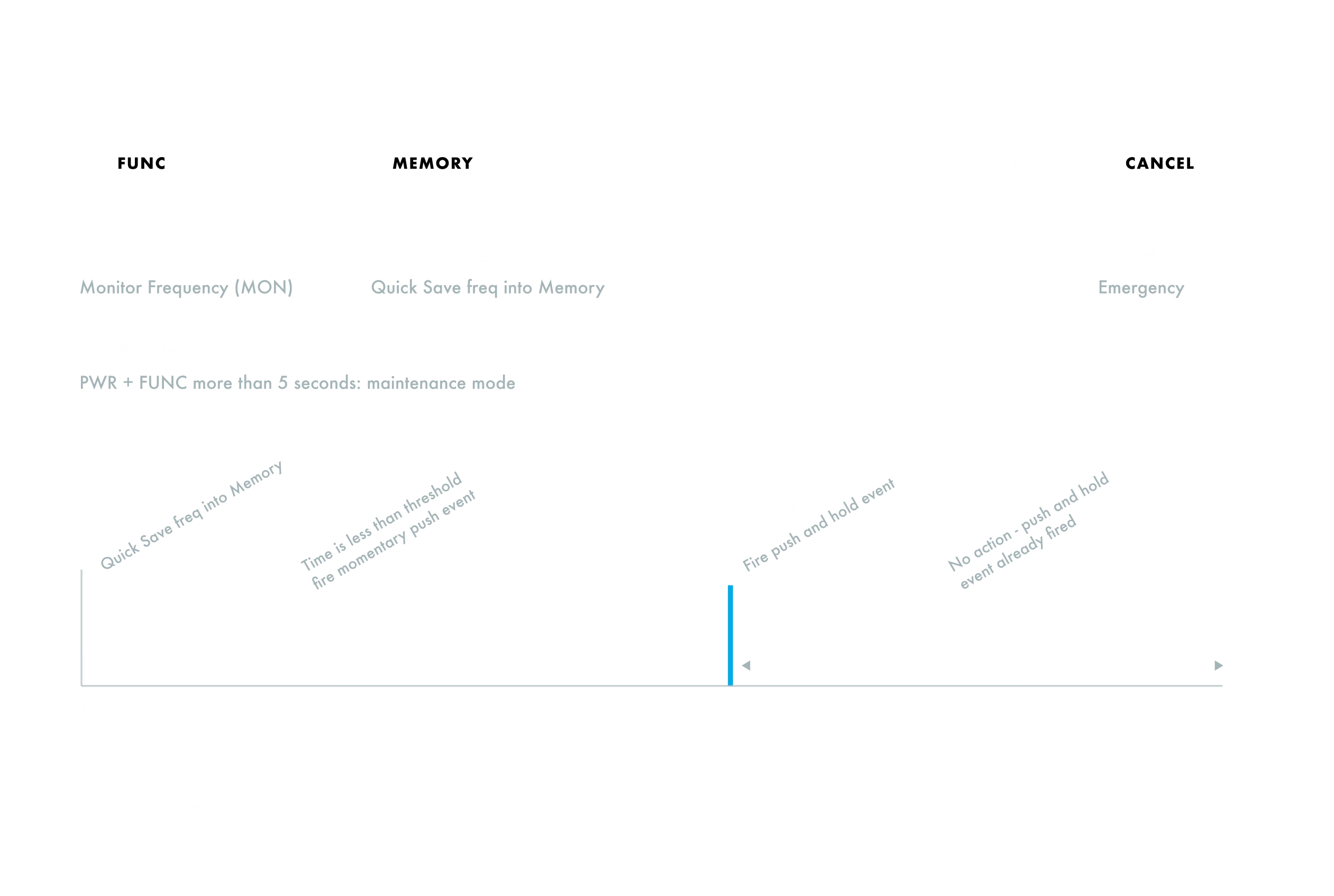
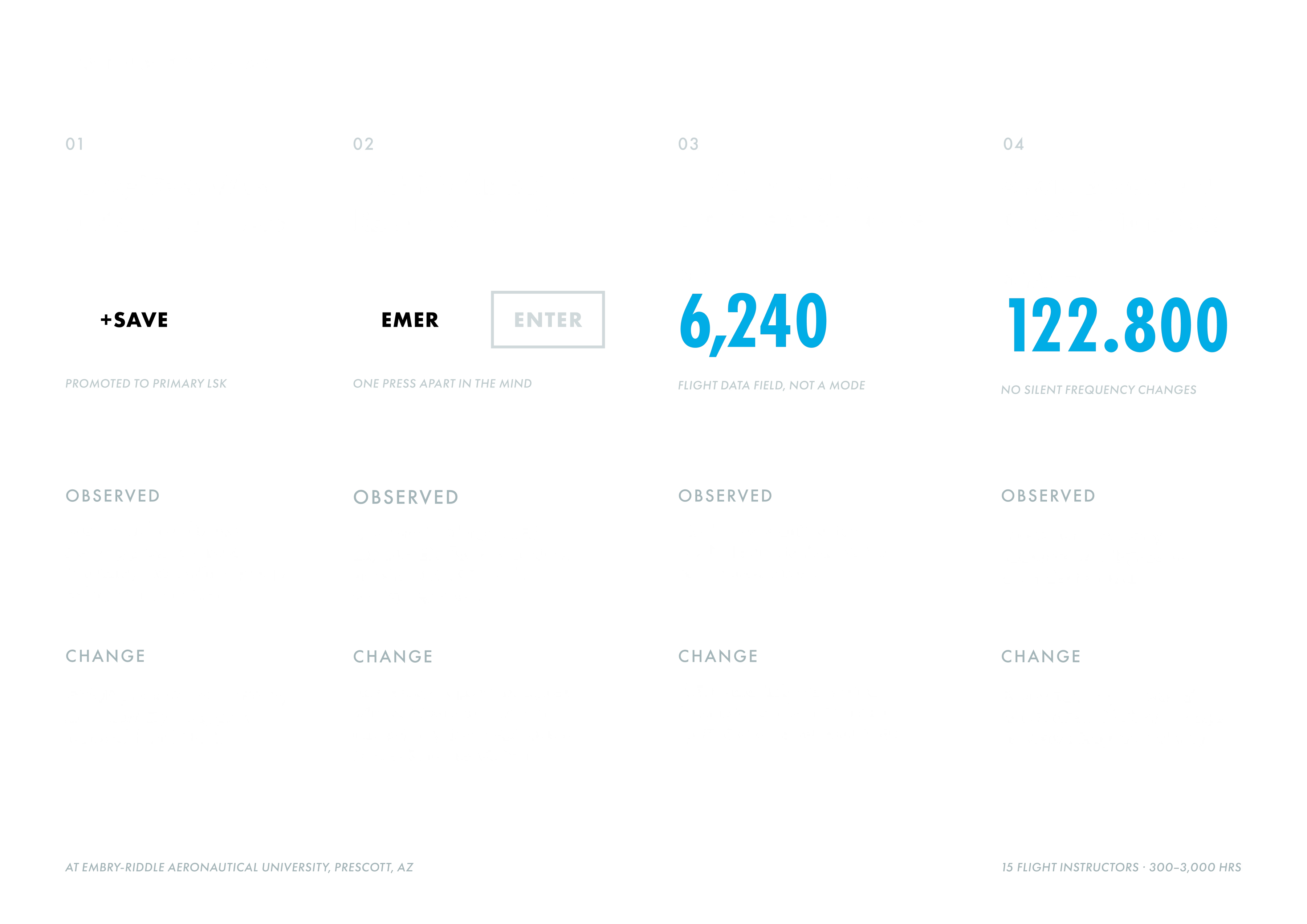
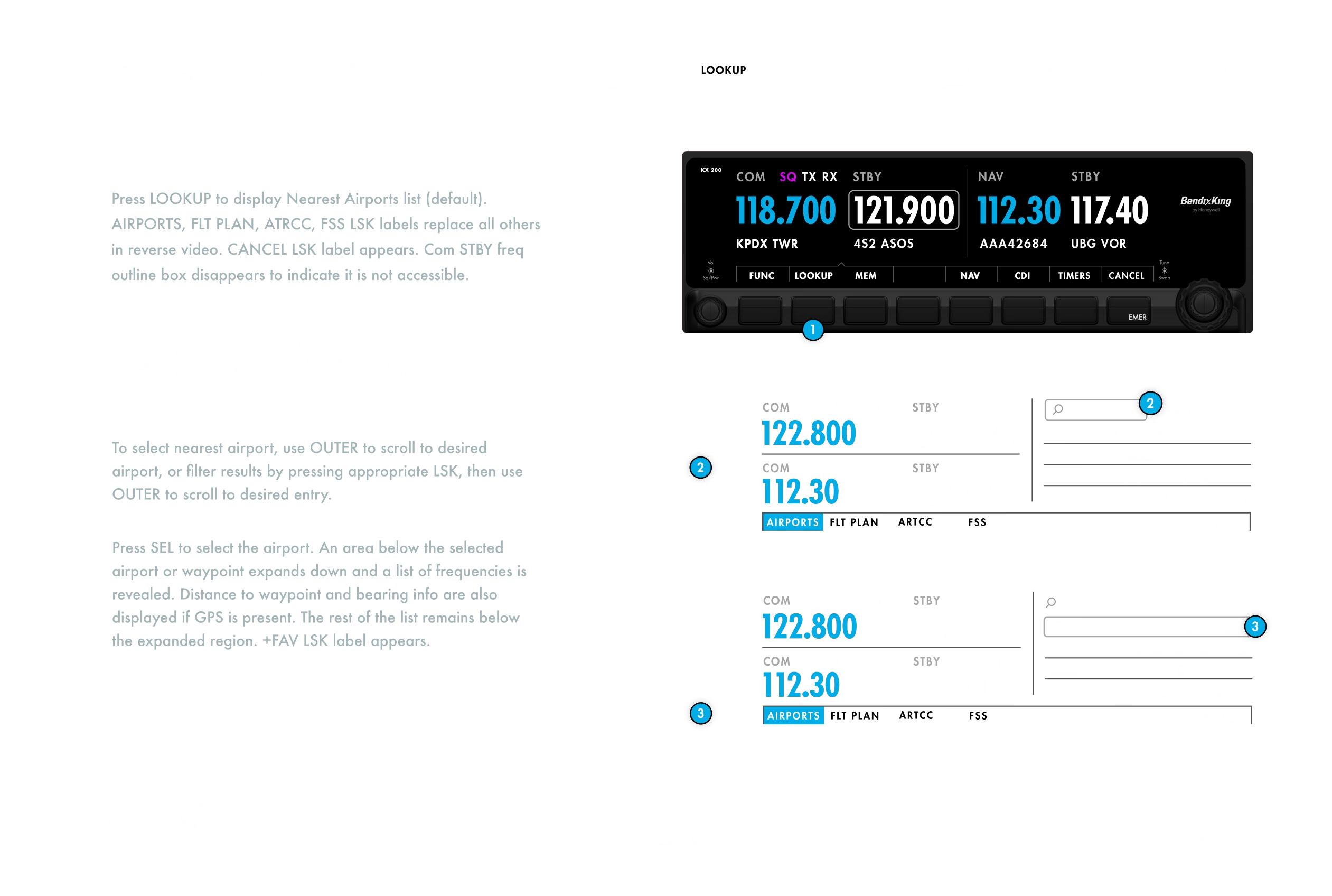
The strongest feedback was operational, not aesthetic. Pilots flagged risks around EMER versus ENTER, accidental frequency swaps, CODE timeout behavior, Flight ID entry, lookup discoverability, and the instinct to touch a screen that wasn’t touch-enabled. The clearest result was the one I least wanted: fifteen of fifteen participants failed to discover the long-press shortcuts, even with on-screen prompts. There is no time to experiment during approach. We replaced the hidden gestures with explicit labels, +SAVE, MON STBY, and VFR, which cost screen area and added buttons on a display that had none to spare. Visibility beat efficiency. Each finding became a refinement to make the system harder to misunderstand under pressure.
For a certified device, interpretation is risk. The KX 200 specification translated the interface into buildable rules for hardware, embedded software, product, compliance, and regulatory teams. It ran as a daily negotiation rather than a handoff, with Summit Projects as design partner and Honeywell’s engineering and certification groups in the room, where every behavior had to be defensible to the engineer building it and the reviewer certifying it in the same sentence. Button behavior, encoder logic, edit states, alerts, timing, startup flows, labels, and edge cases became one behavioral contract.
The KX 200 shipped as an FAA-certified avionics interface under Part 23, cleared through human factors review for cockpit integration. Validation ran with fifteen flight instructors at Embry-Riddle, 300 to 3,000 hours each and all instrument-rated, split between legacy BendixKing and Garmin G1000 backgrounds. We used think-aloud, question-asking, and co-discovery protocols against a full departure sequence, measuring completion, critical errors, and time to task. Nearly every participant finished without a critical error. The result was intentionally quiet: state was legible, interruption was recoverable, and emergency paths behaved the way training expected.
The BendixKing KX 200 underwent rigorous, repeated testing and validation throughout development. The challenge was not a lack of verification, but the timing and traceability of key decisions. Records were maintained manually across multiple files and team handoffs, while the pilot experience of details such as long-press timing was evaluated later than ideal. Establishing stronger links between each decision, its rationale, and its validation evidence earlier would have made the path to certification more efficient.
Working alongside engineers, product managers, pilots, flight instructors, and FAA regulators taught me that great products depend on more than good decisions. They depend on making every decision clear, connected, and defensible. When intent, rationale, implementation, and validation follow the same path, the specification becomes a shared source of truth. With a flight plan for every decision, the product can move forward with clarity, confidence, and a clear path to certification.
.svg)